


Use Section Wrappers to style and customize your Blue Bite Experiences. The Section Wrapper uses the CSS Box Model; “box model” refers to the design and layout of HTML elements that determine the visual appearance of your Experience.
Introduction
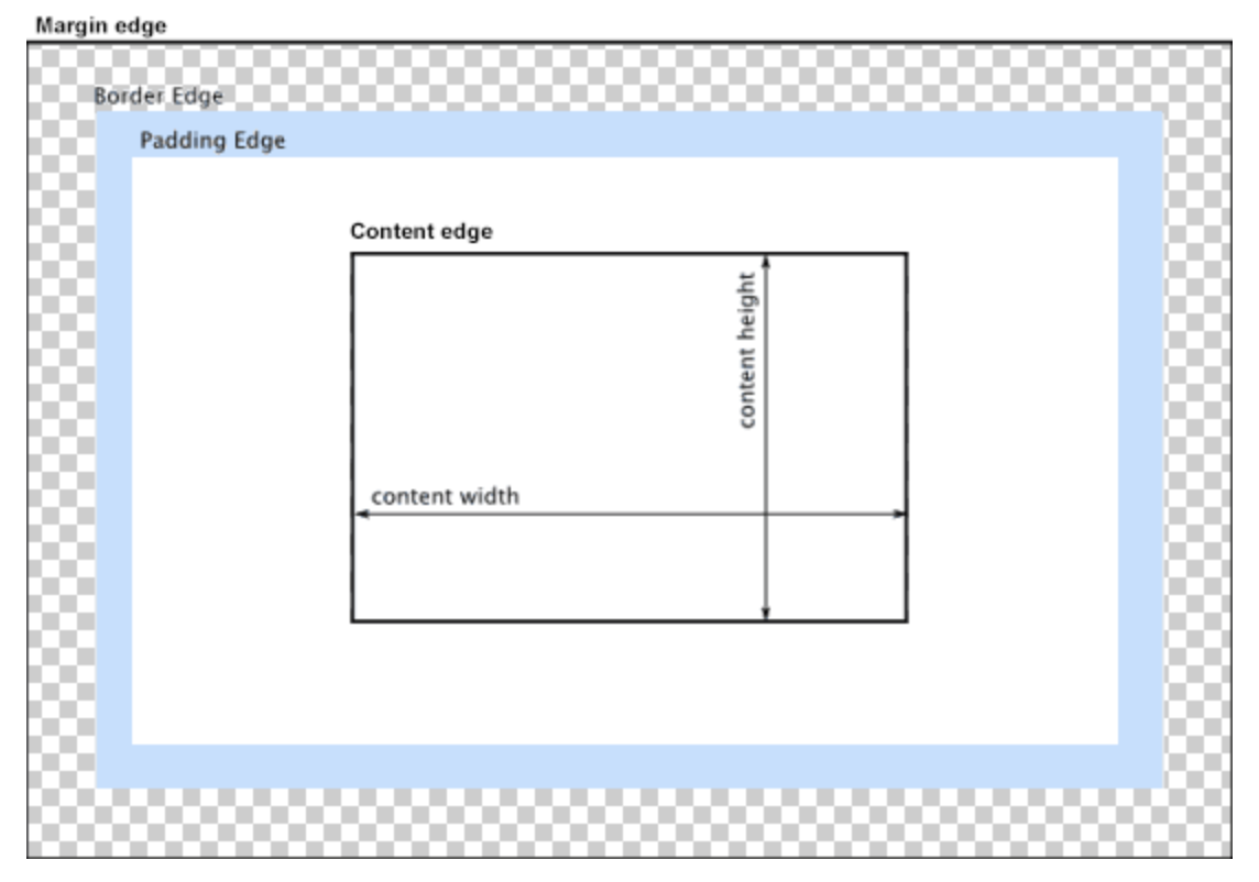
The CSS Box Model houses the content of every HTML element. For example, the box model allows us to both put a border around elements and define spacing between and within them.
There are four major parts to this model:
- Content - The content of the box, which is where any text or images appear.
- Padding - A transparent area around the content.
- Border - A visible border that surrounds the content and padding
- Margin - A transparent area around the border.
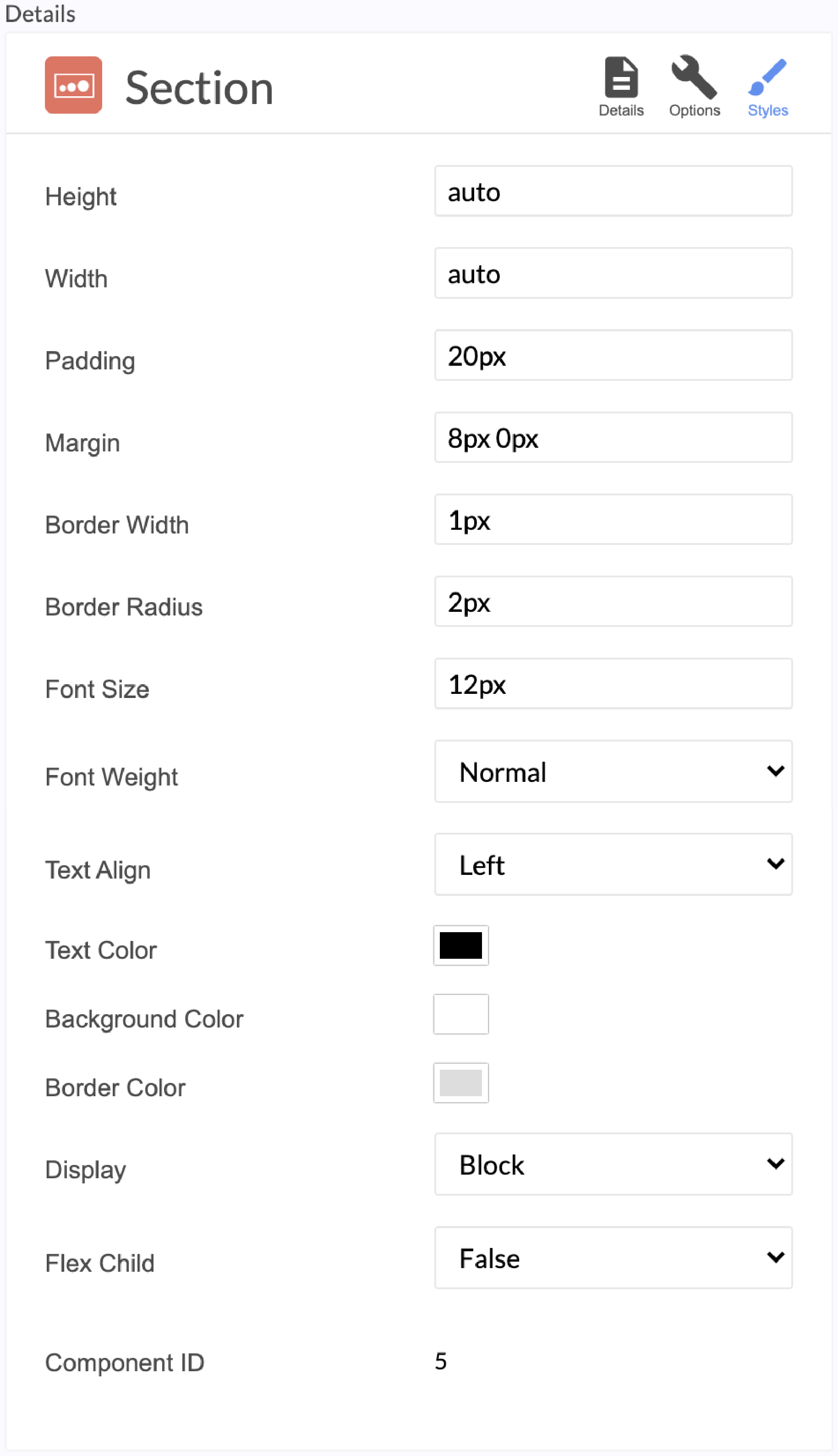
How to Use the Section Wrapper to Style Your Page
Section Wrappers stylize components and wrappers by adjusting their size, dimensions and space between elements. This includes height, width, padding, margin, border width and radius, font size and weight, text alignment and color, background color, border color, and display options like Block and Flexbox.
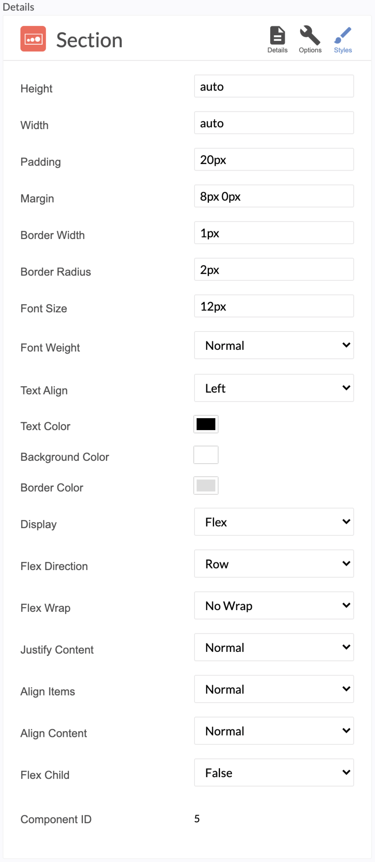
When you select the Section Wrapper, three icons appear in the top right—Details, Options, Styles.
Click the “Style” icon to configure this section’s CSS properties.
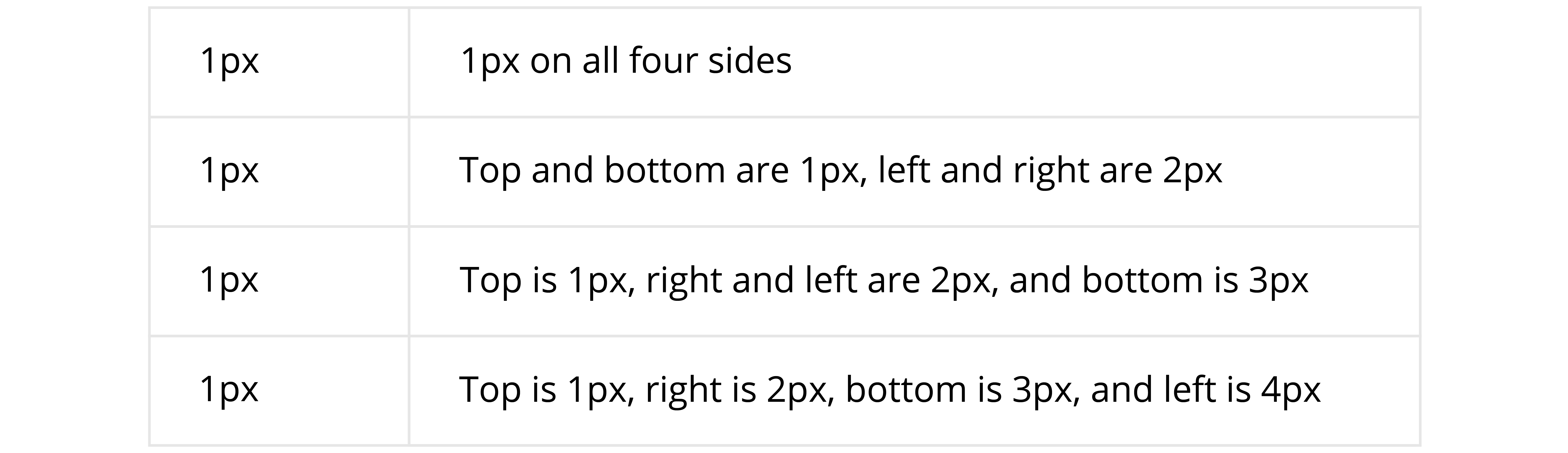
TRBL (Trouble) Acronym
In each field--padding, margin, border width, border radius, font size—you can add different dimensions for the top, right, bottom and left edges. Remember to follow the TRBL (pronounced Trouble) acronym when you order these dimensions.
TRBL - Top, Right, Bottom, Left
TRBL Design Table Example
Style Settings
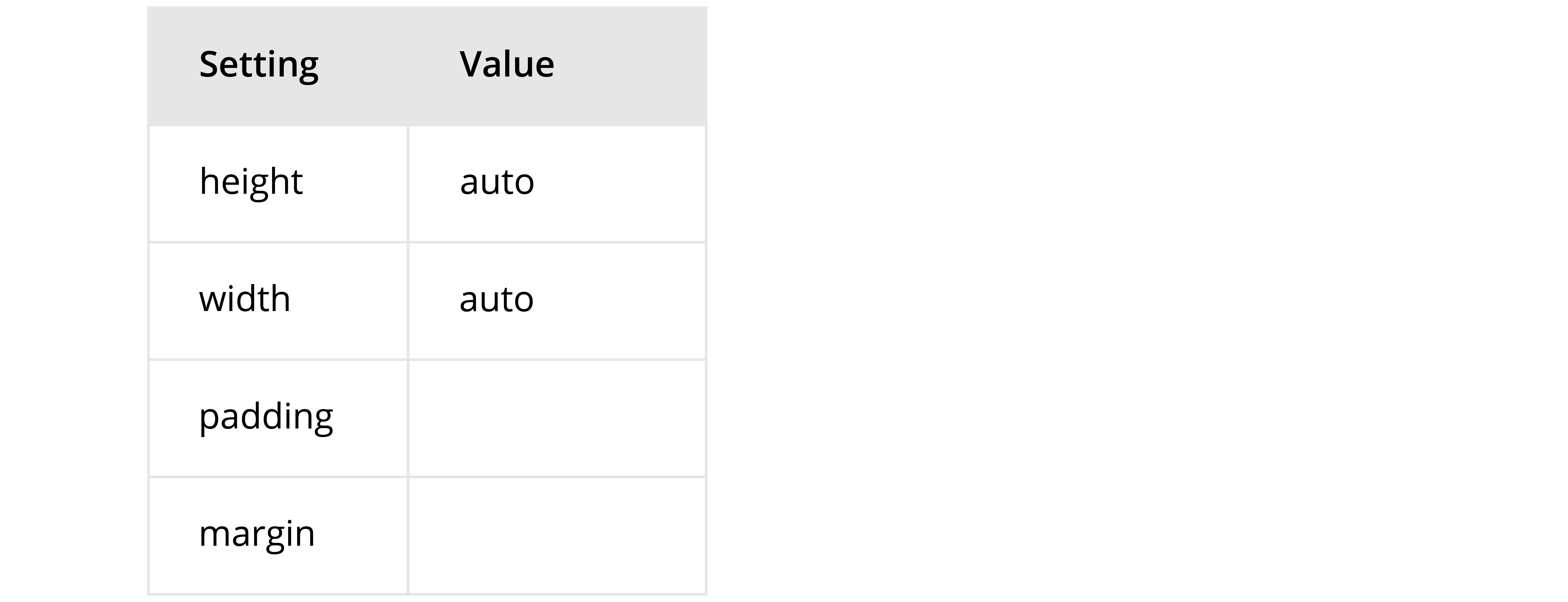
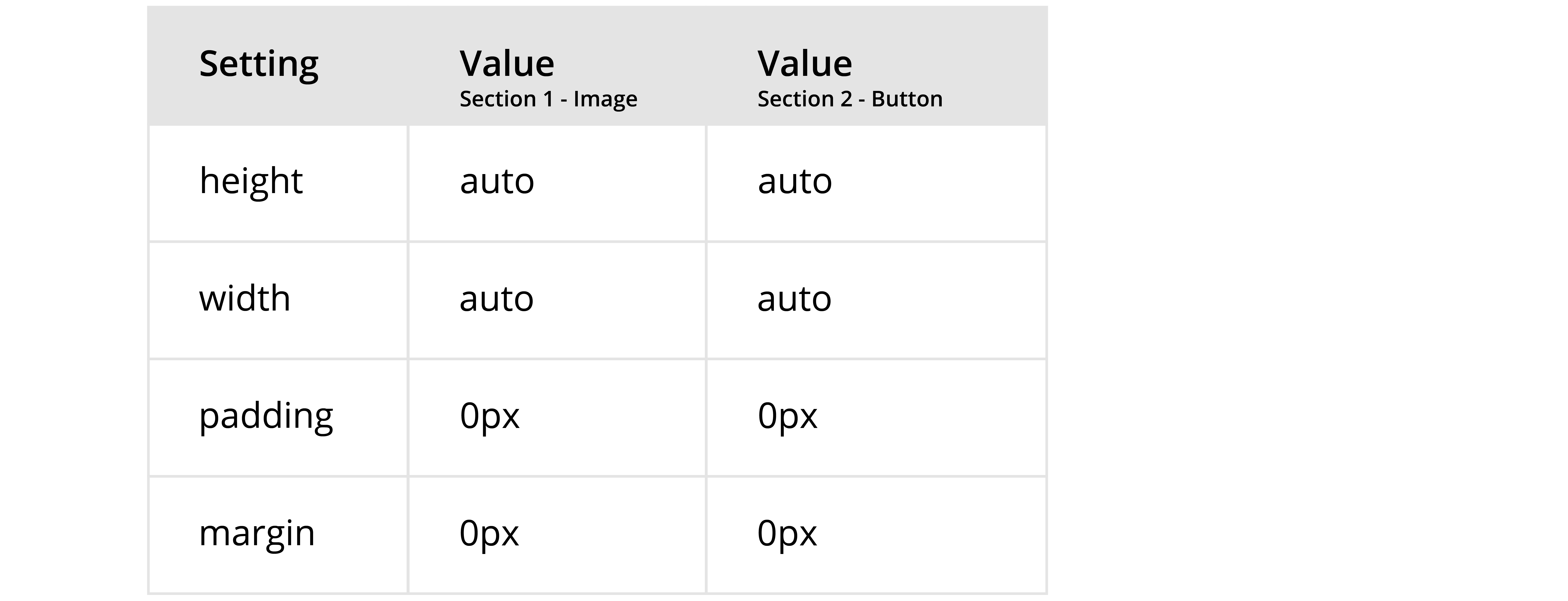
Height and width
The height and width refer to the size of the content itself, not the section as a whole — meaning any additional padding, margins or border will be excluded. If you set a height to be larger than a device’s display, the content will get cut off. Adjusting the height and width impacts the content housed in the section, not the entire section.
The following examples show how experiences display different with different settings.
Studio Settings
Resulting Experience Display
.png)
Studio Settings

Resulting Experience Display
Margin
This field controls the placement of the section. You can do so using the TRBL acronym, discussed above.
Border Width and Border Radius
The border width and radius fields control both the size and shape of your border. The border width controls the width and size of your border, while the border radius allows you to customize how round the corners of the border will be.
Padding
Padding refers to the dimensions of the the very first box that surrounds the content, is transparent and shows the background color.
Font Size
Sets the size of any text within this section.
Font Weight
Indicates the weight of the text, and allows you to toggle between light, normal and bold.
Text Align
Indicates the orientation of any text contained in this component. There are four options: left, right, center, justify.
Text, Background and Border Color
The Section Wrapper allows you to adjust the color & opacity of the text, background and border. You can choose from a preset list, enter the Hex code or enter the RGB values. To adjust the opacity, you can adjust the percentage or use the second toggle bar.
Display Options
The Section Wrapper has two display options: Block and the Flexible Box Module.
The Block display property is enabled by default. Each component will start on a new line, creating a new block of content and, aligningsetting the components up vertically. Components without their own styling options will automatically scale to the maximum width of the section.
The Flexible Box Module, or flexbox for short, is made up of a parent container and its children. This is specified using the “Flex Child” drop down. Selecting “False” identifies the section wrapper as the parent, while selecting “True” identifies the section wrapper as a flex child.
After selecting the Flexbox option, you will see six additional dropdowns appear.
Flex Direction - this establishes the “main axis,” specifying the direction the flex children appear.
- Row (default): left to right
- Row Reverse: right to left
- Column: top to bottom
- Column reverse: bottom to top
Flex Wrap - this specifies if your flex children should be laid out in a single or multiple lines.
- No Wrap (default): keep all content on one line
- Wrap: content will wrap onto multiple lines from top to bottom
- Wrap Reverse: content will wrap onto multiple lines from bottom to top
Justify Content: this specifies the alignment of your flex children along the main axis.
- Normal/Flex Start: aligned along the start of the section wrapper
- Flex End: aligned along the end of the section wrapper
- Left: aligned along the left edge of the section wrapper
- Right: aligned along the right edge of the section wrapper
- Center: aligned along the center of the section wrapper
- Space Between: evenly distributed in line; first flex child aligned along the flex start and last flex child aligned along the flex end.
- Space Around: evenly distributed in line with equal space around all flex children
- Space Evenly: equal spacing between all flex children, flex start, and flex end.
Align Items - specifies alignment along the cross axis.
- Normal/Stretch: stretches to fill the height of the section wrapper
- Flex Start: aligned along the top of the section wrapper
- Flex End: aligned along the bottom of the section wrapper
- Center: aligned along the midpoint of the section wrapper
- Baseline: aligned along flex children’s baseline.
Align Content* - specifies alignment of each line.
- Normal/Stretch: auto stretches to fill the height of the line
- Flex Start: aligned along the top of the section wrapper
- Flex End: aligned along the bottom of the section wrapper
- Center: aligned along the center of the section wrapper
- Space Between: evenly distributed in line; first flex child is aligned along the top of the section wrapper where the last flex child is aligned along the bottom of the section wrapper
- Space Around: evenly distributed in line with equal space around all flex children, top and bottom of the section wrapper
*This only applies when there are multiple lines in a flexbox.
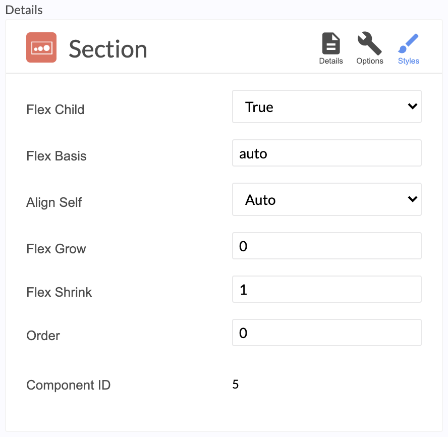
After specifying if the section wrapper is a flex child, five additional styling options appear.
Flex Basis - specifies the default size of the flex child. This allows specific inputs in acceptable CSS Units or the below values.
- Auto: flex child scales to the maximum width of the section wrapper
- Initial: flex child scales to its default value
- Inherit: flex child scales to its parent’s section wrapper width
Align Self - specifies if flex child should inherit or override parent’s alignment settings
Flex Grow/Shrink - if necessary, this specifies if a flex child can scale bigger/smaller at a different ratio than other flex children within parent.
Order - specifies the order of your flex children. If left at 0, all flex children will appear in source order.
Acceptable Units in Section Wrapper
Note that you are not restricted to pixels as measurements in the Section Wrapper. See below for an introduction to additional CSS units you can utilize in the Studio.
Pixels (px)
Pixels are the smallest discrete component of an image. Pixels are a standardized unit of measurement that will not change across devices.
Viewport Height (vh)
The viewport height refers to the visible height of a user’s screen, which will vary by device. It’s important to note this does not include the height of the browser’s navigation bar, so 100vh can result in some scrolling.
Viewport Width (vw)
The viewport width refers to the visible width of a user’s screen, which will vary by device.
Percentage (%)
The percentage value is based on either the height or width of the containing block of an element.
Helpful Tips and Best Practices for Using the Section Component
- Before you start, zero out all the fields in the style section.
- Set bottom margin to zero when possible, in order to avoid unintentionally pushing down content below.
- Layer images and other components on top of each other by using negative margins. When using negative margins, components that are lower down in the page are in the foreground.
- If you do not use negative margins, the start of one component will be at the end of the previous one from a top to bottom layout.
- When layering components, there is an order of what will appear on top, regardless of margining. Galleries will always remain on top, and within gallery swipers will appear over grids. i.e. It is not possible to place a text component on top of a gallery.
- If no border is needed, zero out the field with 0px instead of 0%.
- If no background color or border is being used, always set the border and background colors to 0 opacity ensuring that any accidental coloring is transparent.
- These styling tips also apply to the Form, Button, and Twitter components.
- Make sure to provide a meaningful name for every section wrapper in your studio file so it is easier to find and edit.
- Studio Experiences are built for mobile devices. As you stretch the width out the height will scale according to the width. Use pixels or calc to adjust the height and percentage for width.
How to Layer Multiple Components in the Studio
Utilize negative margins to place components on top of another. When layering, it is important to remember that one piece of content will appear above another if it is negatively margined from below.
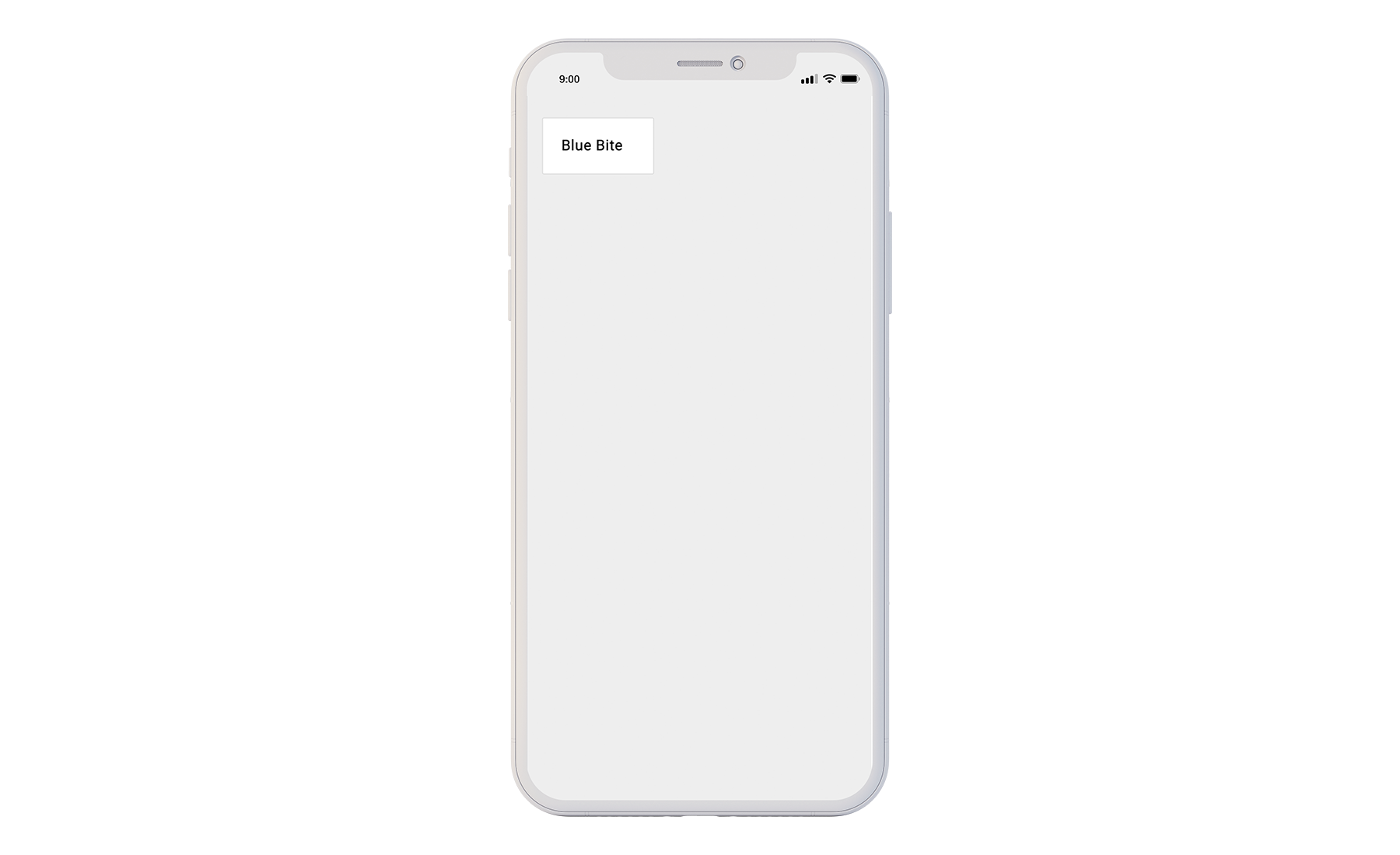
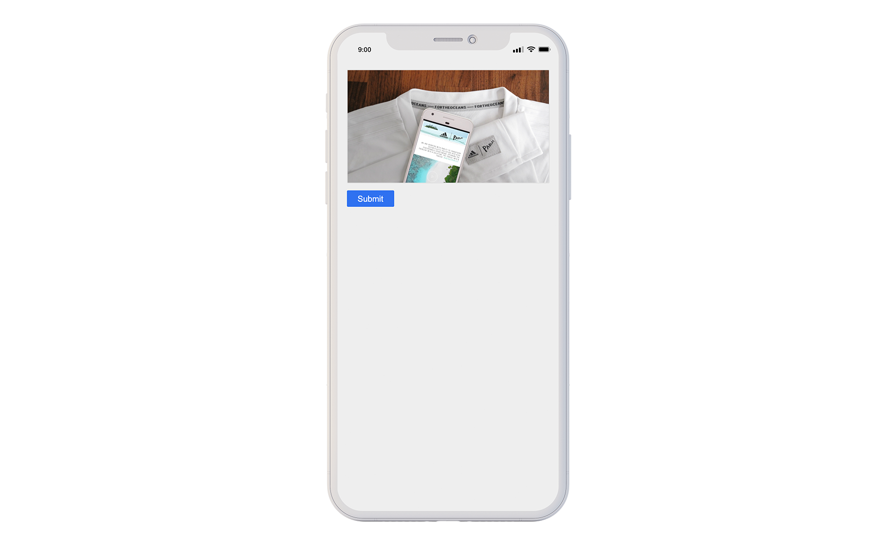
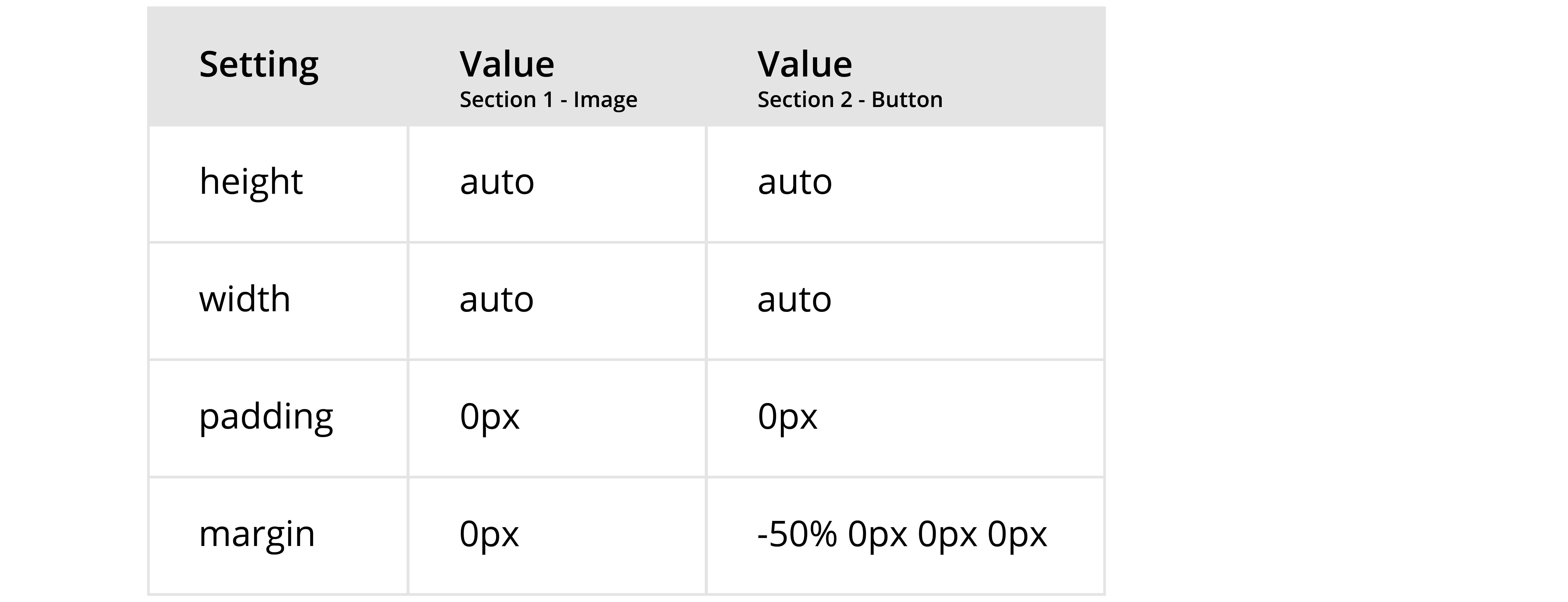
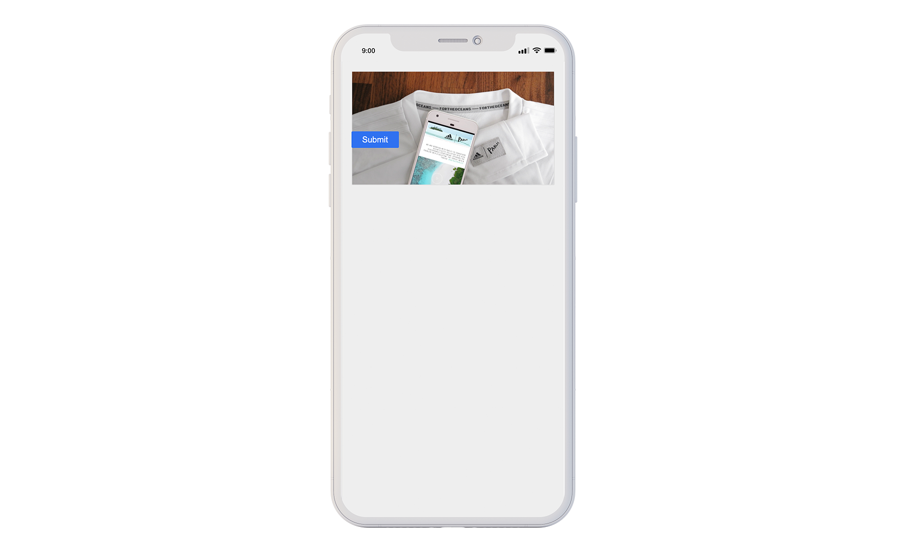
Example: How to place a Button on top of a background Image by adjusting the Margin.

A. In this first layout, the Button is placed directly under Image 1.
Studio Settings
Resulting Experience Display
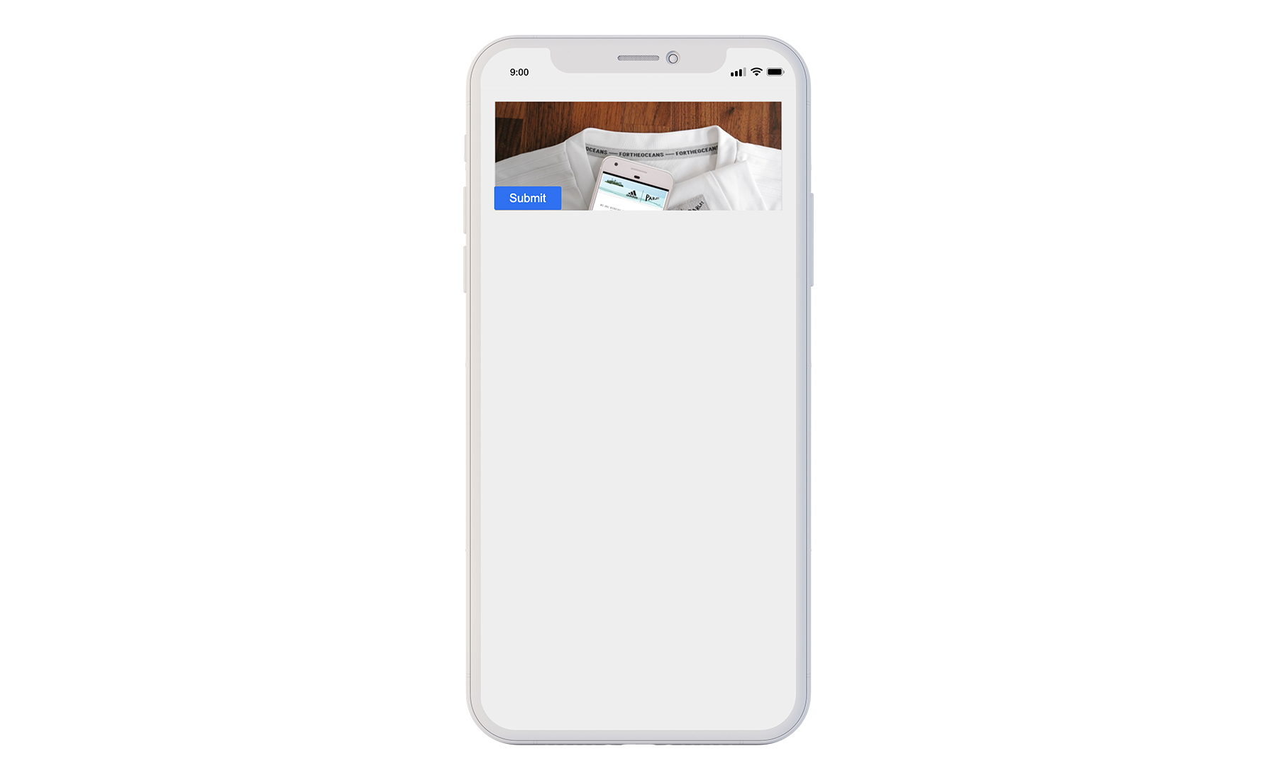
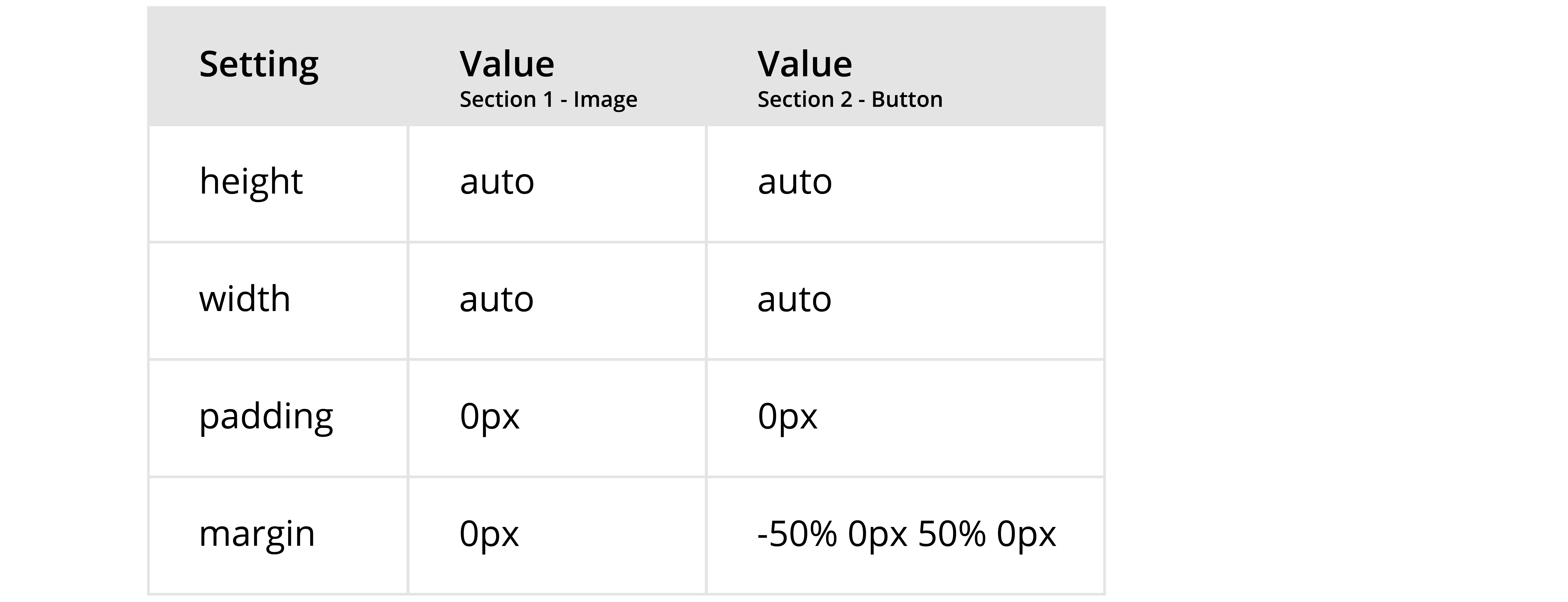
B. Notice that the shark image gets cut off as the top margin of the button component gets negatively margined up.
Studio Settings
Resulting Experience Display
The Button component has its own styling options. Adjust the margin either in the Section Wrapper or within the Button’s settings.
C. To offset the image being cut off, change the bottom margin of the button component.
Studio Settings
Resulting Experience Display
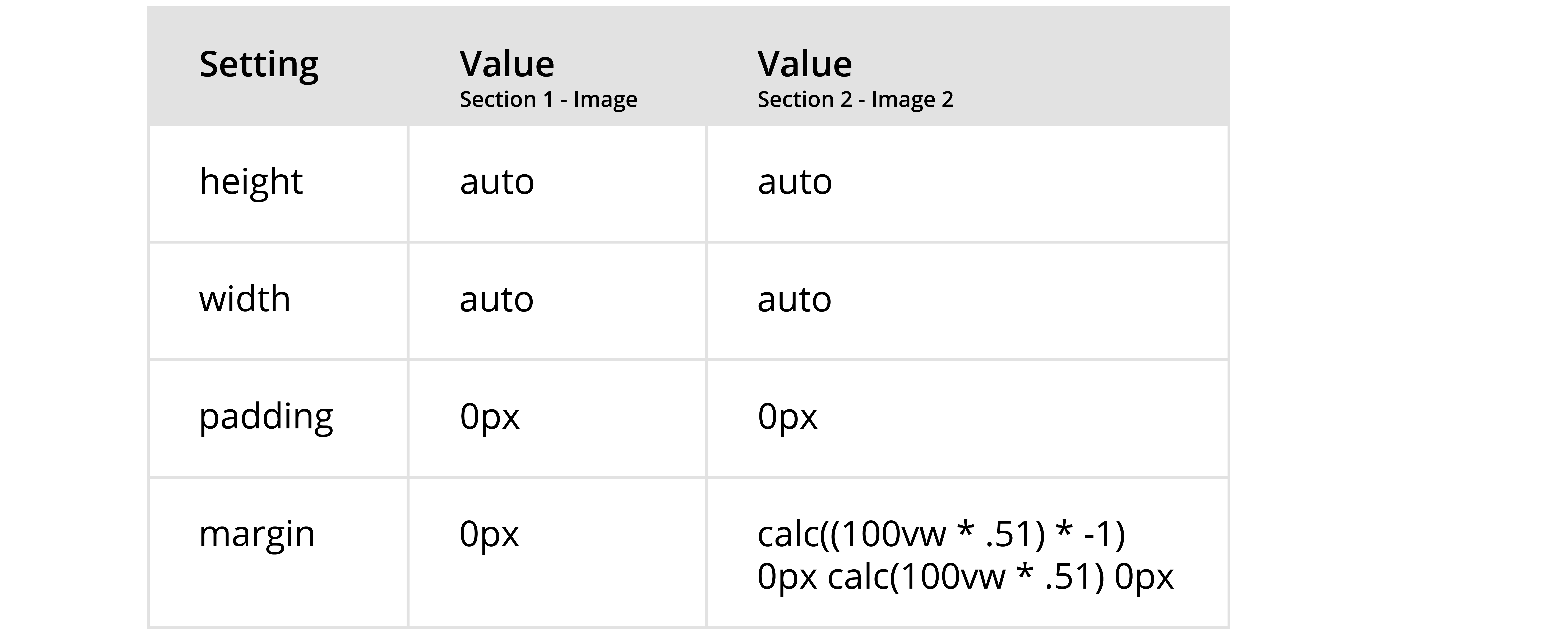
CALC Function
The purpose of the calc function is to align two images at the same height.
The calc() function a mathematical expression as its parameter, while the value that is used is the result of this expression. Any simple expression, utilizing the following operators can be used: addition, subtraction, multiplication, and division. For example, you could set the height of an HTML element to be calc(100% - 50px). This means that no matter what device your experience is being viewed on, this element will have a height of the full length of the given screen minus 50 pixels. The CALC function is mostly used with height and width, but can also be used with margin.
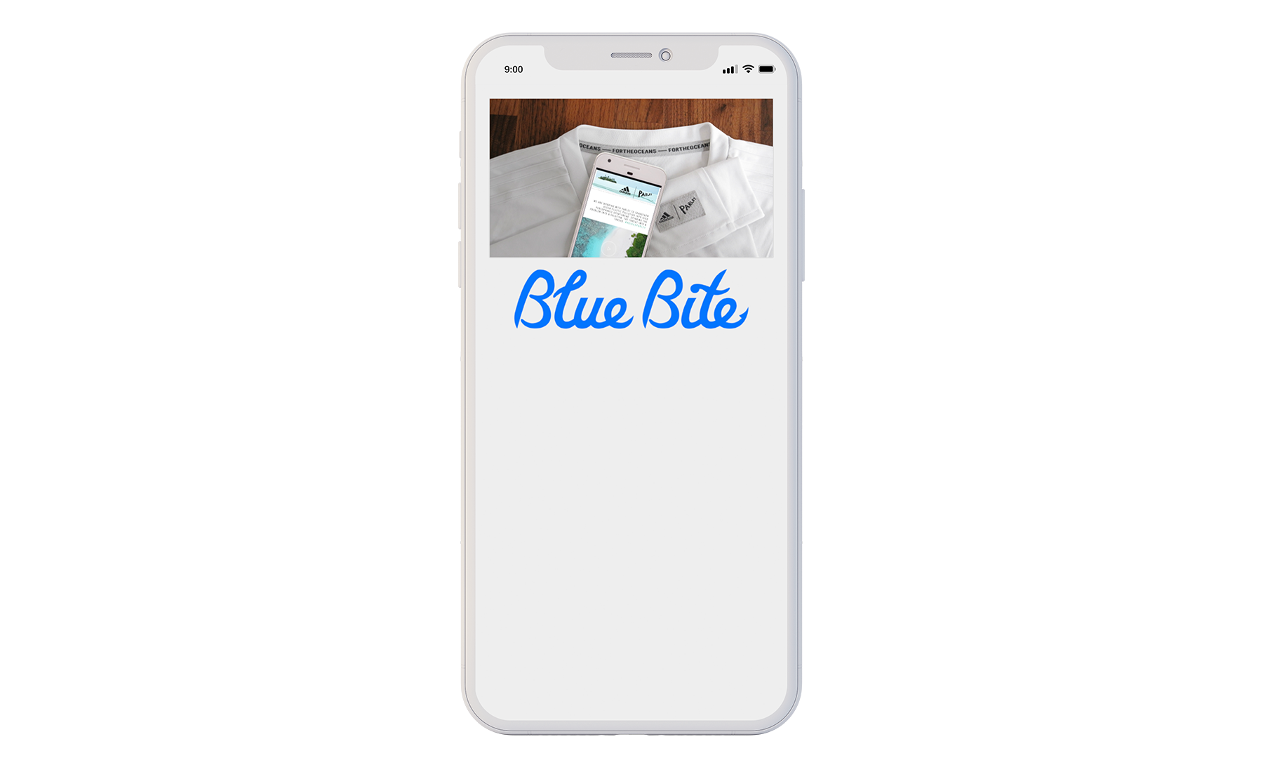
Example: How to use the calc() function to align two images to the top of the page
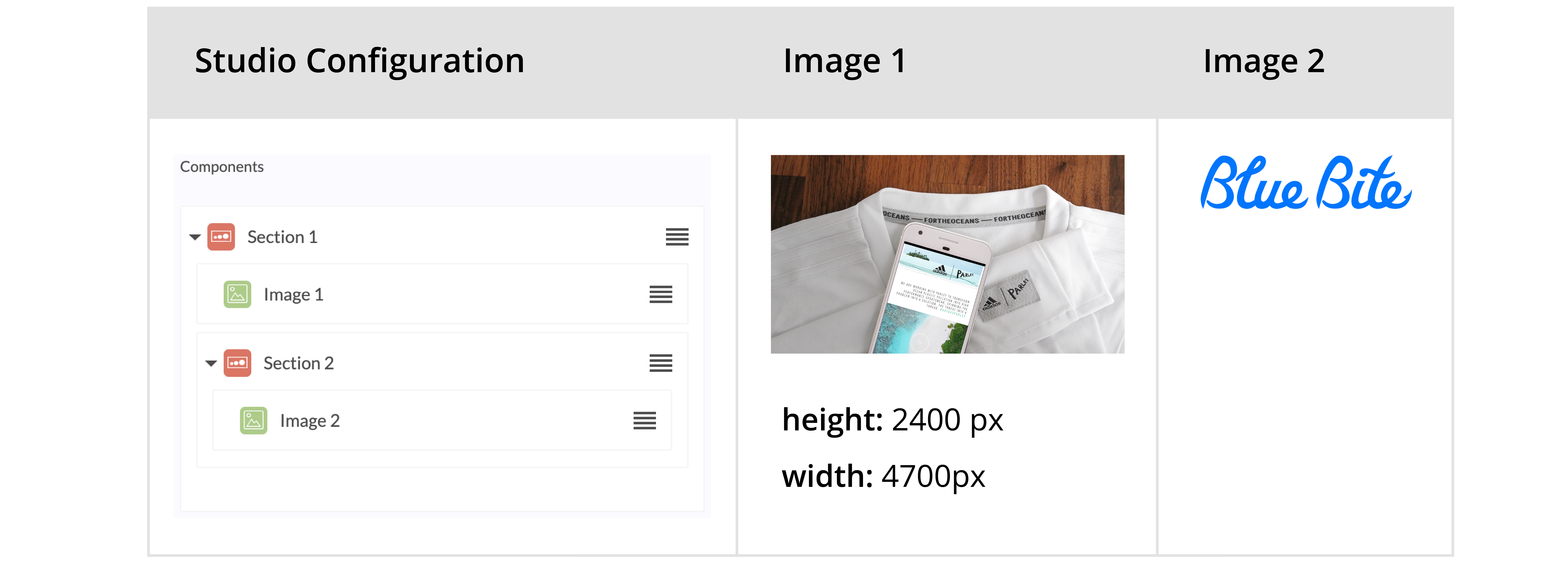
A. In this first layout, Image 2 is placed directly under Image 1.
Studio Settings
Resulting Experience Display
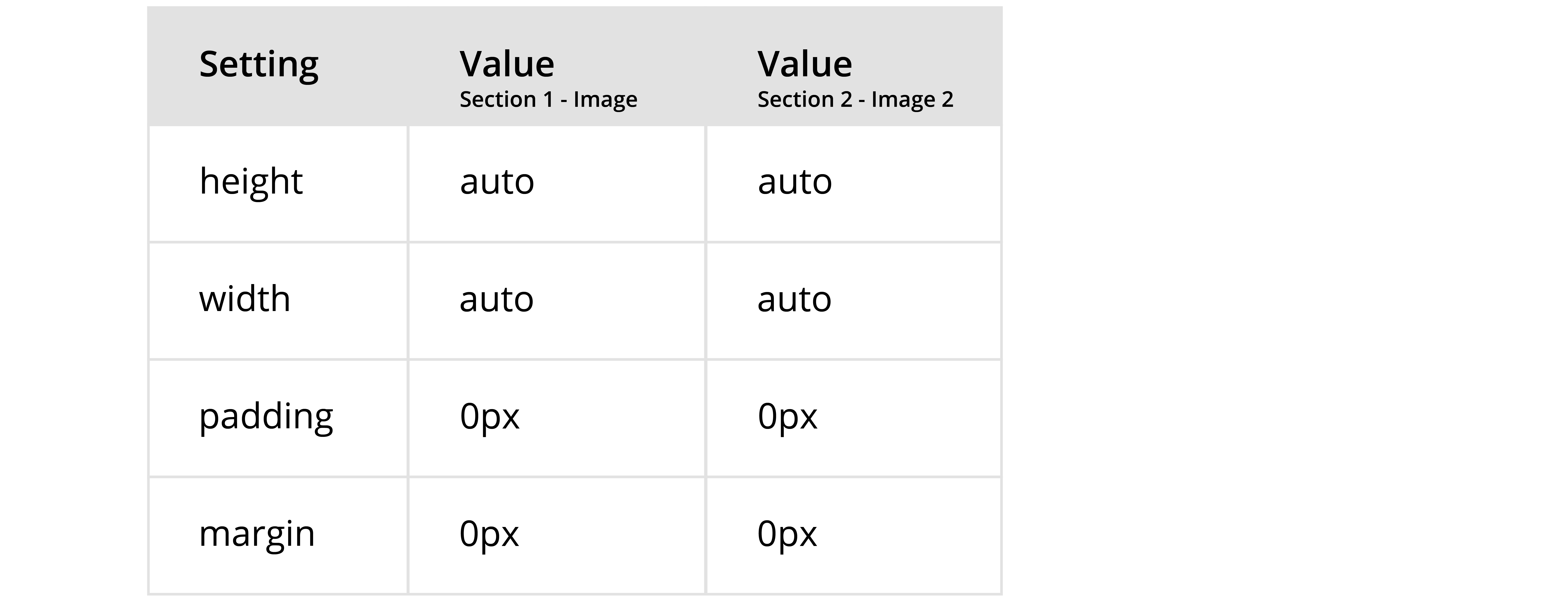
B. Use the CALC function to determine the precise number of units required to move Image 2 up to the top of Image 1
Formula: calc((100vw * (height of image 1/width of image 1) * -1)
Studio Settings
Resulting Experience Display
Additional Resources
More
Tutorials


