


The Flexible Box Module, commonly known as flexbox, is one of two display options available within the section wrapper component of the Blue Bite Studio. This tutorial explores how to create a custom table using the flexbox option, taking a deep dive into how choosing different options will change the display of elements in your Blue Bite-powered experience.
For more information on the flexbox options in general, see the Display Options headings in the Style Your Studio File Using Section Wrapper tutorial.
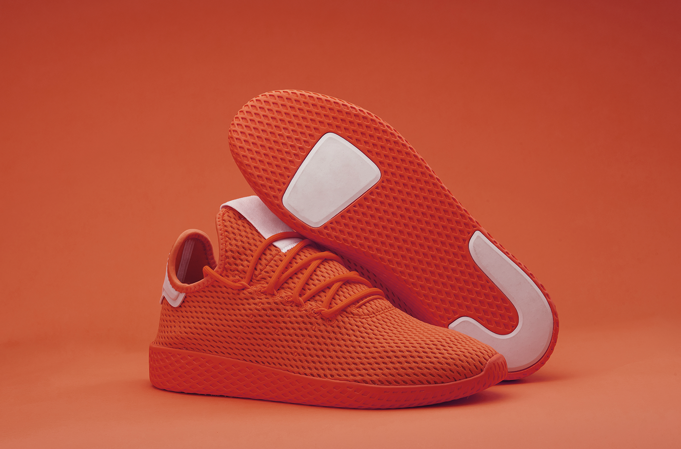
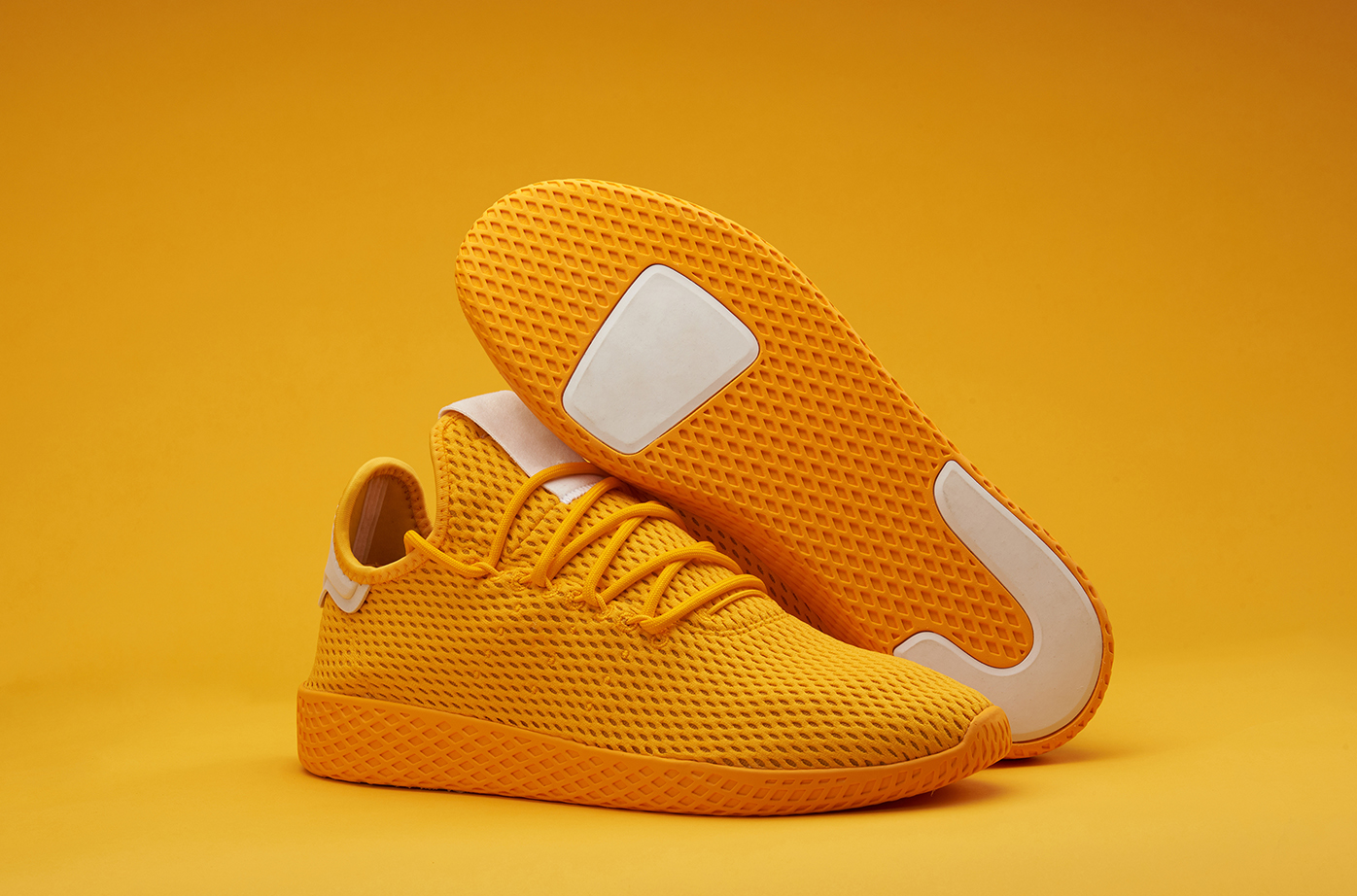
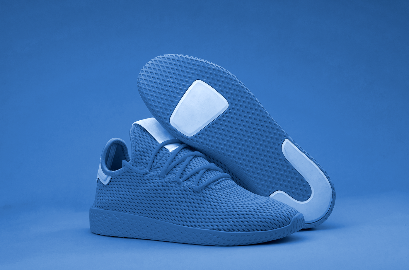
Images Used
The following images will be featured in all the configurations represented in this tutorial.
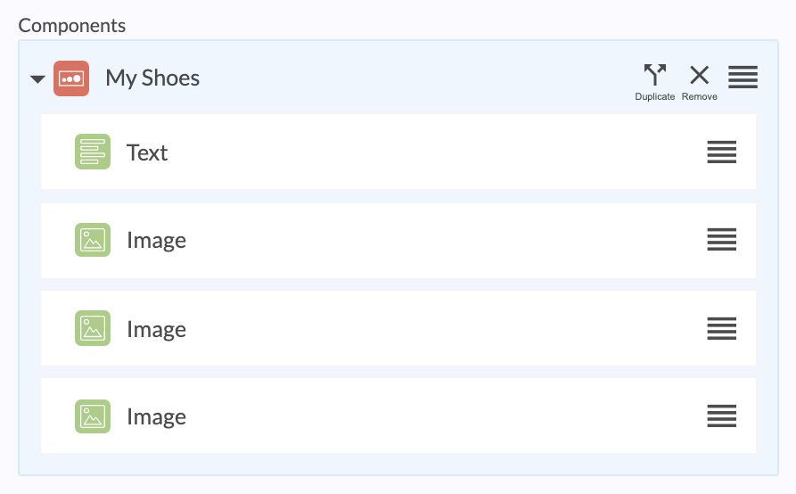
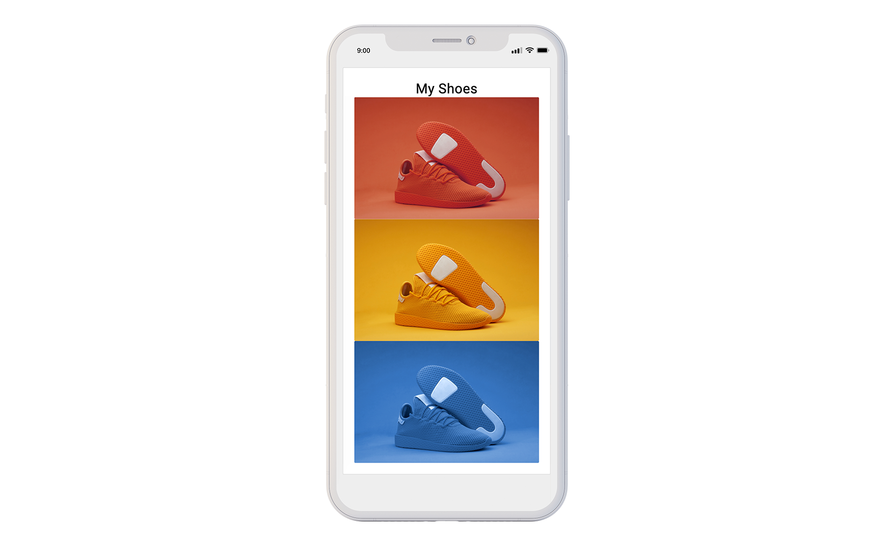
Step 1 - Default Layout
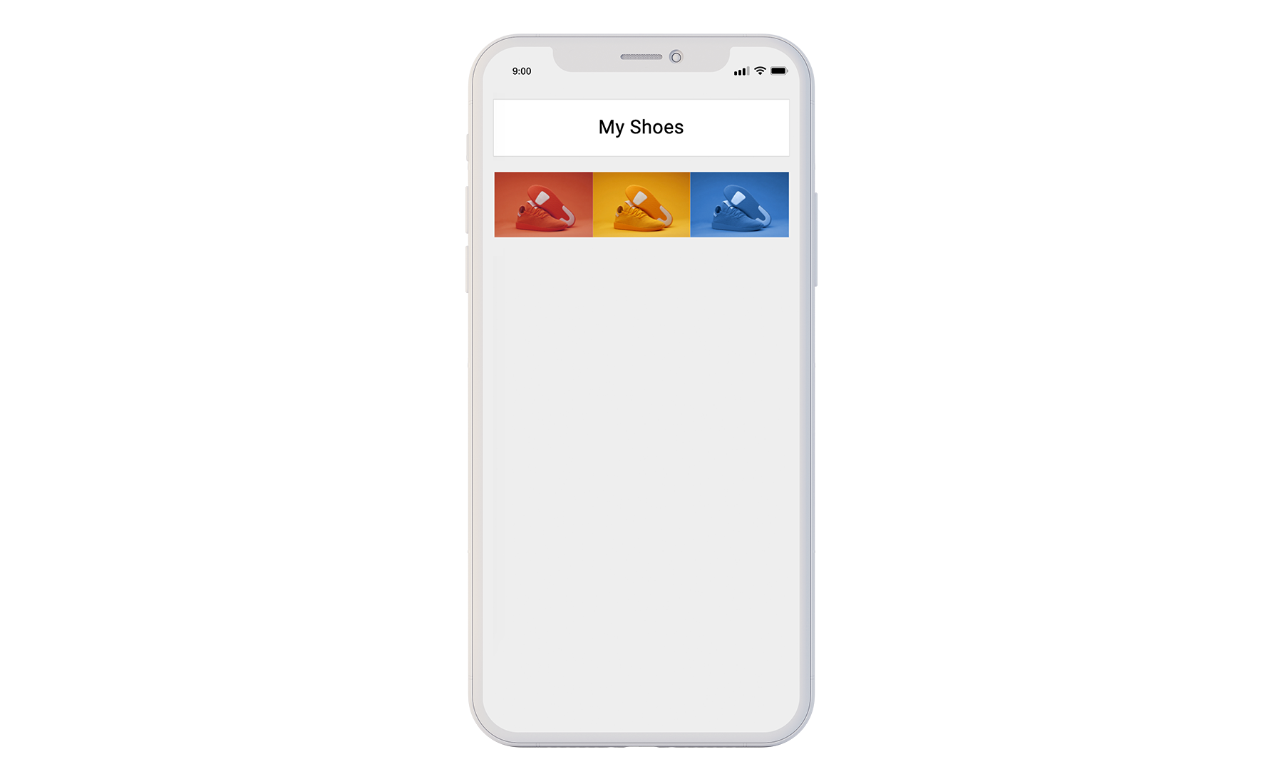
Adding all of the images into a section and adding a text title will produce the default layout seen in the preview below.
Default Layout Preview
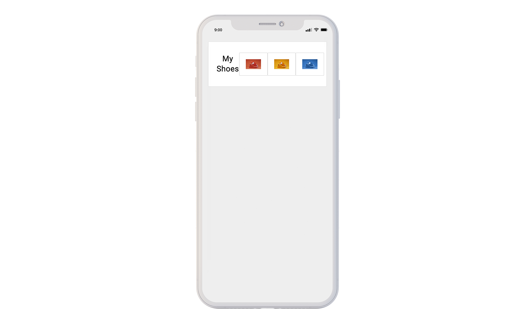
Step 2 - Change to Flexbox Display
The Block display option is enabled by default in the Blue Bite Studio. In the Details panel, change the section’s settings from “Display = Block” to “Display = Flex”. The preview image below shows how the images now display in a horizontal row rather than a vertical column.

Flexbox Display Preview
Step 3 - Create a Child Container
Duplicate the section you've made and keep the title in the first section while moving the images to the new second section.
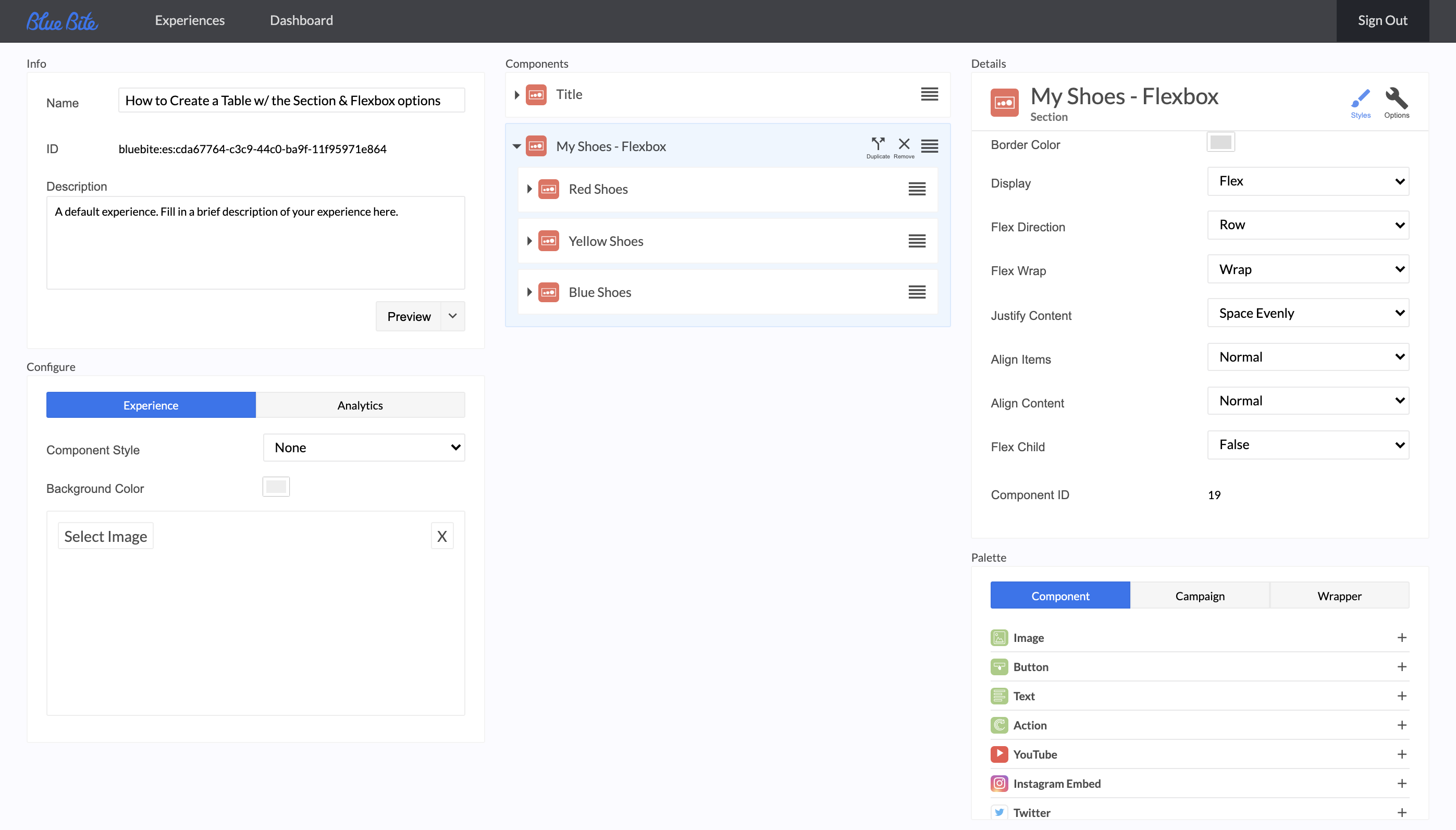
Then place each shoe image in its own section. Change each of these sections' default setting from “Flex Child = False” to “Flex Child = True”. You'll now see that the text spans across the row of images.
Flexbox Child Container Preview
Let's Get Advanced
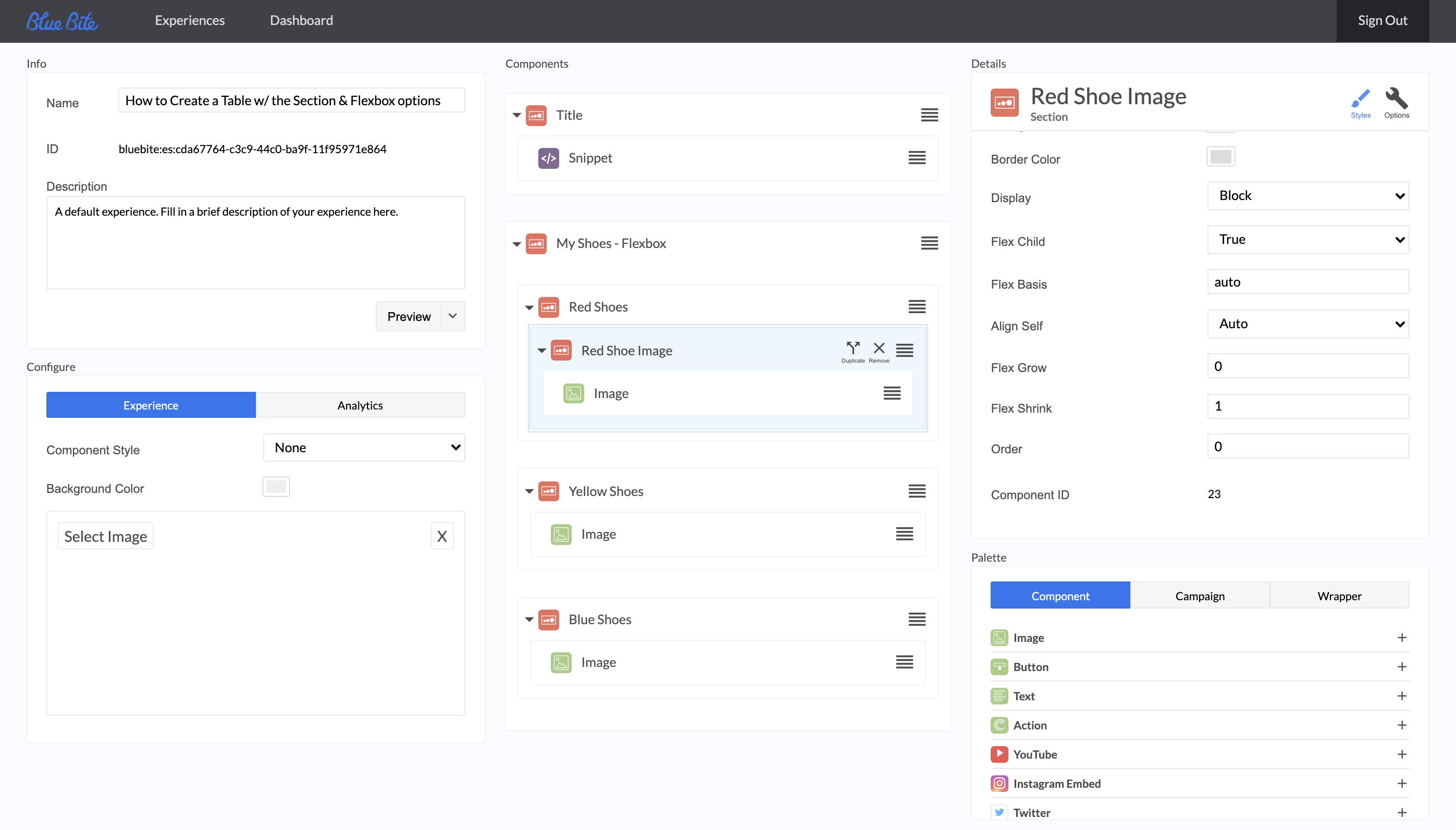
Step 4 - Fine Tune Your Display
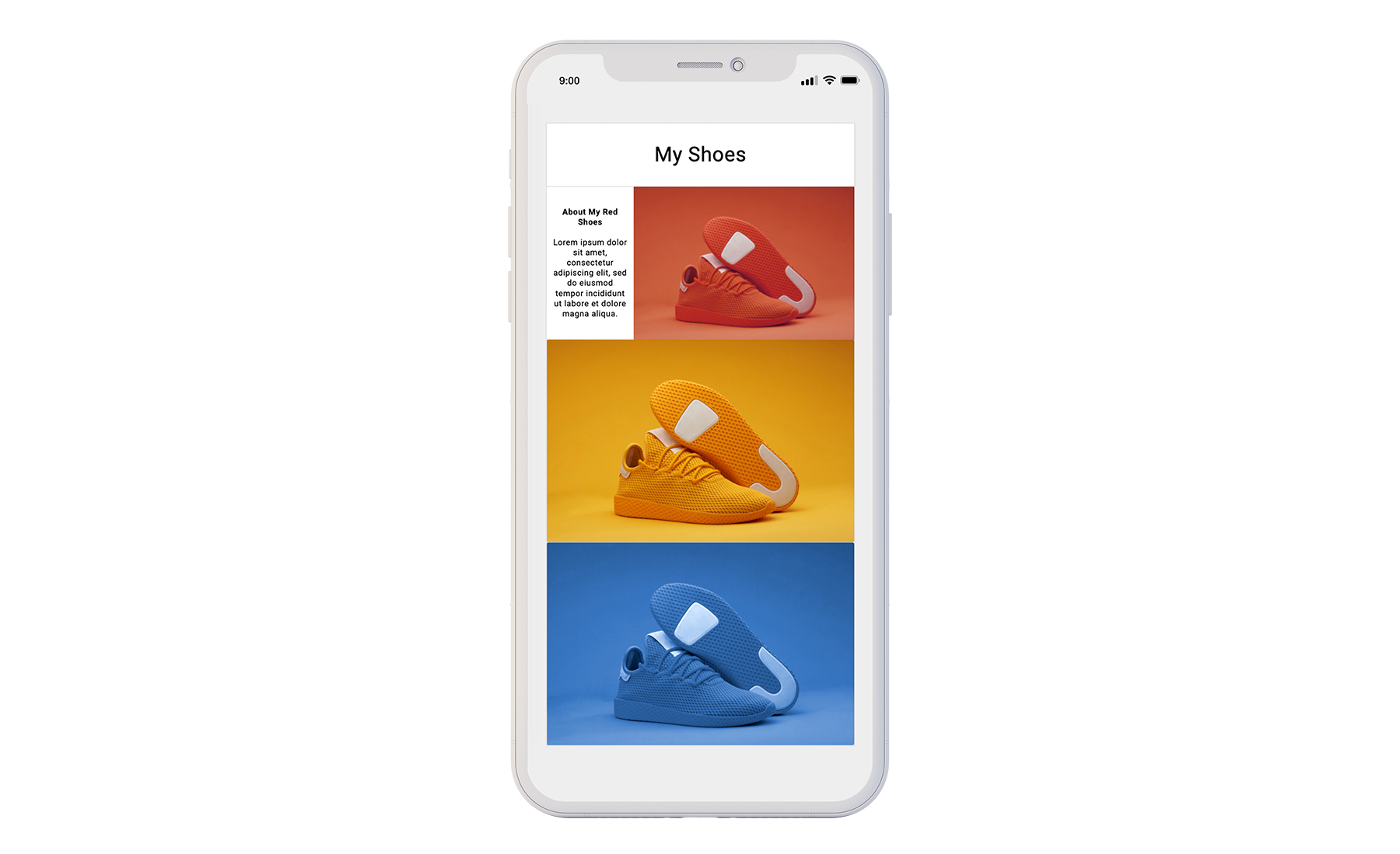
Now that you've seen what these controls do you can further customize the look of your table. Here's an example of a customized table.
First, add a section with a snippet component. Change this section from “Flex Child = False” to “Flex Child = True” and add in the description to the snippet component.
Then, place the Red Shoe’s image into yet another section.
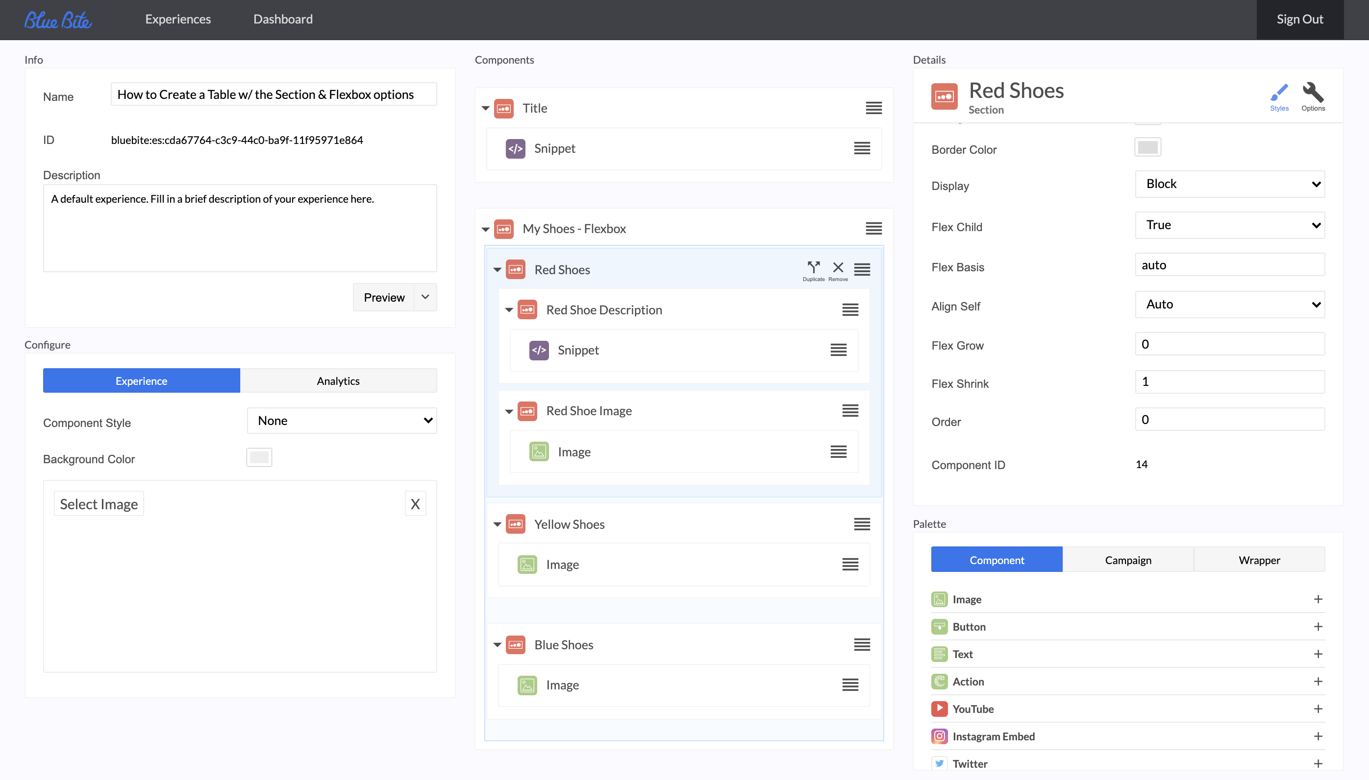
Change this section to “Display = Flex” AND “Flex Child = True” (this allows you to customize the alignment of the Red Shoe image and description while the outermost section allows you to customize the alignment of all shoe sections.
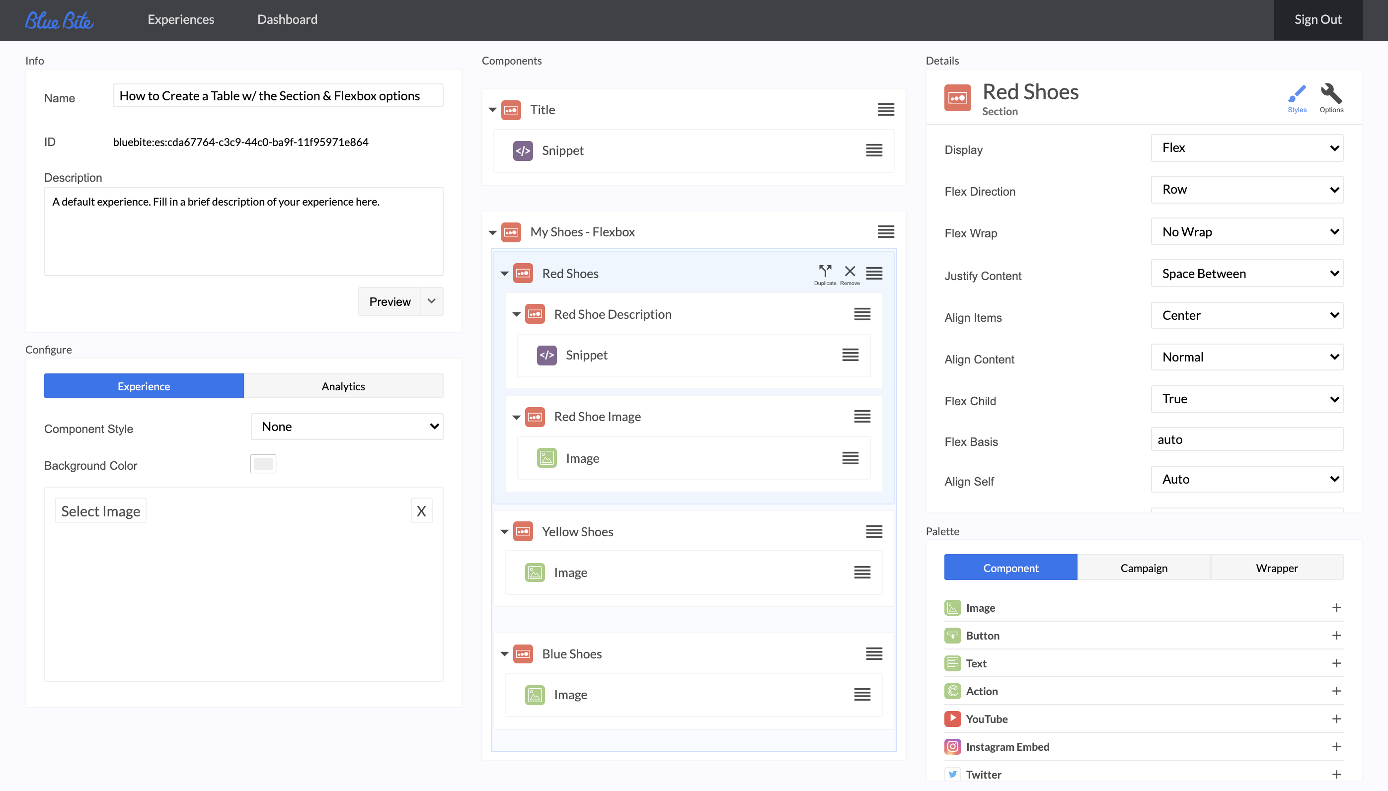
Now, Change the Red Shoe section’s “Justify Content - Normal” to “Justify Content - Space Between” and “Align Items - Normal” to “Align Items - Center”
Advanced Controls Preview
As you can see, there are a multitude of options when using the Flexbox display option within Section Wrappers in the Blue Bite Studio. These allow full control over how images and text display to provide your end user the best digital experience possible.
More
Tutorials


