This documentation is for our current platform, hosted at bluebite.com. If you are still using the mtag.io Object Manager or Studio to manage your Blue Bite account, please see our Legacy Documentation.
Components & Wrappers
Components and Wrappers are the building blocks of the Studio. They are modules of content that can be added, removed, duplicated and reordered to create your mobile web page.
Components
Image
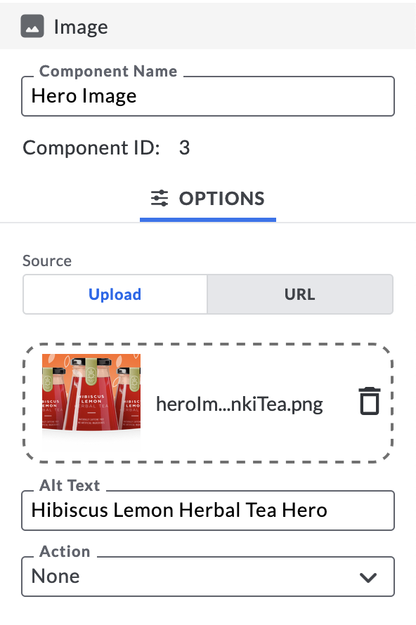
The Image component inserts images into your Experience, and you can either upload images directly or specify an image URL. You can name components to keep your Experience build organized, and you can assign actions to images, such as linking to a URL, linking to another Experience, updating tag variables, submitting form information to a CRM, or performing an action linked to other components and/or wrappers. See the Action section below for more on these capabilities.
Image Alt Text
Adding alternative text to images is a best practice for web accessibility for two reasons.
- Screen readers do not describe images without alt text. If you provide descriptive alt text, visually impaired users will be able to understand on-page images.
- If an image file cannot be loaded, provided alt text will appear in its place.
We recommend that you provide descriptive alt text for all images included in your Experiences. You can read more about alternative text on Moz.com.
Button

The Button component adds an interactive button to your Experience, which can be customized to perform a multitude of actions. See the Action component below for more on Studio Actions.
Customize the look and feel of a Button by adjusting its size, color and placement. The Studio follows CSS pixel guidelines, TRBL (Top, Right, Bottom, Left), to customize padding, margins and border widths.
Text

The Text component adds text content to the rendered Studio Experience. You can use our built-in text component to edit copy, apply styling or add hyperlinks.
Some tips:
- For additional styling options, nest a Text component within a Section wrapper. In this case, the font style applied in the will supersede the Section style if adjusted to anything other than “Normal”.
- You can nest a Text component within an Event wrapper after a Form Submit to, for example, thank users for submitting their information.
Action

The Action component fires a specified action when set conditions are met. You can set the Action to link to a new URL, redirect to a new Experience, change a Local or Object variable, or submit a Form.
- If the Action component is not nested in an Event wrapper, the action will occur upon page load.
- If the Action component is nested inside an Event wrapper, it will occur only when the conditions for that Event are met.
Choose the desired action taken once an Action’s set conditions are met.
URL Link
End users are redirected to a specified URL.
Experience Link
End users are redirected to a different Studio Experience.
Object Variable
Object variables are Object properties that can be edited by consumers who interact with an Object. Users cannot change Object Attributes such as color via the Experience Studio. However, Object variables allow users to specify dynamic attributes that can be edited via user interactions on the Experience. One common use case for this is product registration. By utilizing the object variable action, users can change the registered status of an object, and the Experience content can subsequently change based on that status. See Custom Attributes for further details.
Conditions for Updating Object Variables
- Limited to one update per interaction.
- Time To Live (TTL) of 5 minutes.
- If a user interacts with an Object and they are on the Experience page for more than 5 minutes, they will not be able to update the Tag Variable.
- The Tag Variable can be updated regardless of the Verification status of the interaction (true, false, null).
Local Variable
Local variables represent in-page actions end users take while visiting an Experience and are saved locally on their device. Local variables are available until a devices’ browser local data and device cookies are cleared. Local variables enable Studio users to build complex experience logic via Actions, Images, Buttons and Events.
Variable Name
Variable Names should be consistent across all components and wrappers involved in their respective conditions.
Variable Operation
The Variable Operation "Set" will create a variable once the component has been rendered. "Increment" or "Decrement" will count how many times a given action has occurred and will deploy an action variable once a user has tapped a set number of times (when an event is set to trigger at a certain increment).
Value
The value is the input set to satisfy the variable condition in order for the outcome to occur (True, False, 1, 2, 3, etc.).
Clearing Your Cache. If you clear your browser’s cache and storage, the next preview or interaction will appear as it would on your first-ever interaction. You can find general instructions on doing so here.
Local Variables Interacting With Two Devices
Local Variables are scoped at the Experience and device level, but can be accessed by tapping different objects.
Example: Two Objects share a Studio file with Local Variable: page_count set to `increment` by `1`. If `Object A` is viewed/tapped/scanned followed by `Object B`, the value of page_count would increase from 1 → 2.
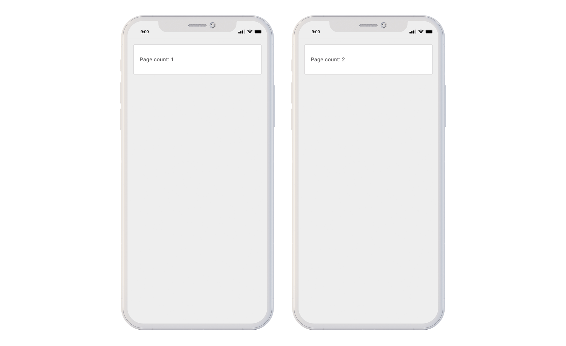
Interaction with Object A (left). Interaction with Object B (right).
To ensure that local variables are unique to each Object, you can namespace the Local Variable with a macro.
Example: page_count_{{tag:uuid}}.
Naming the Local Variable in this way would change the overall behavior to increment only in the case that Studio file, device, and Object are the same.
Interaction with Object A (left). Interaction withObject B (right).
See more on Macros.
YouTube
Utilize the YouTube widget to show an individual video, playlist or user.
How to identify the Source ID from a YouTube URL
Individual Video:
after “v=” https://www.youtube.com/watch?v=iJkfzOZtIpw
Playlist:
First video - after “list=”
https://www.youtube.com/playlist?list=PL_qOD08ucjy0CJ4PksXfZ6NmH66OW1lhM
Next video in playlist - after “list=” and including the “&index=”https://www.youtube.com/watch?v=FibPav9B4zc&list=PL_qOD08ucjy0CJ4PksXfZ6NmH66OW1lhM&index=3
User:
Shows the most recently published video - after “user/” https://www.youtube.com/user/BlueBiteLLC
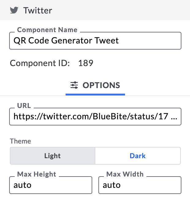
Input the URL for either a Twitter account or a singular tweet into the Twitter component in the Studio.
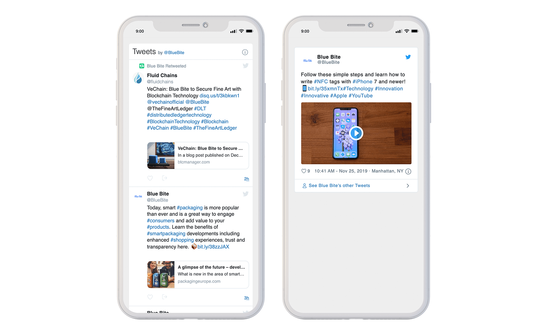
For example, https://twitter.com/BlueBite will show Blue Bite's entire Twitter feed, allowing the user to scroll down through multiple posts (left).
Alternatively, https://twitter.com/BlueBite/status/1158489972174970885 will show this specific tweet, not the entire feed (right).
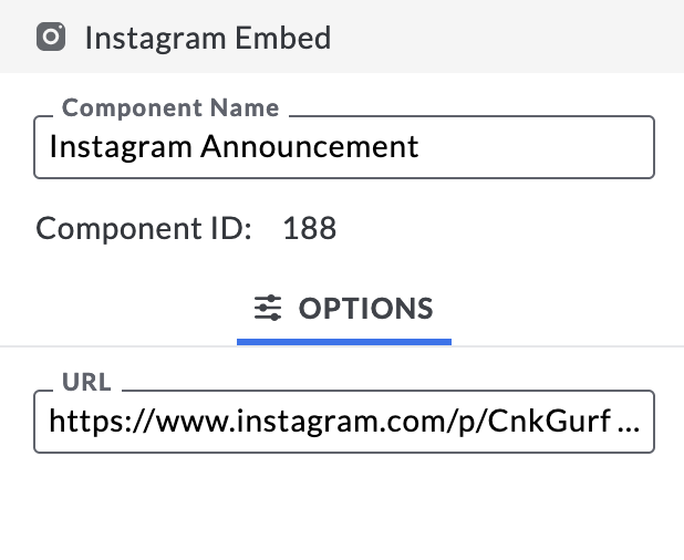
Input the URL for a single post to embed the Instagram component in a Studio Experience.
Example: https://www.instagram.com/p/BzYYltCFC_K/

Note: We only support embedding individual posts in an Experience – we do not support embedding entire profiles accounts in an Experience.
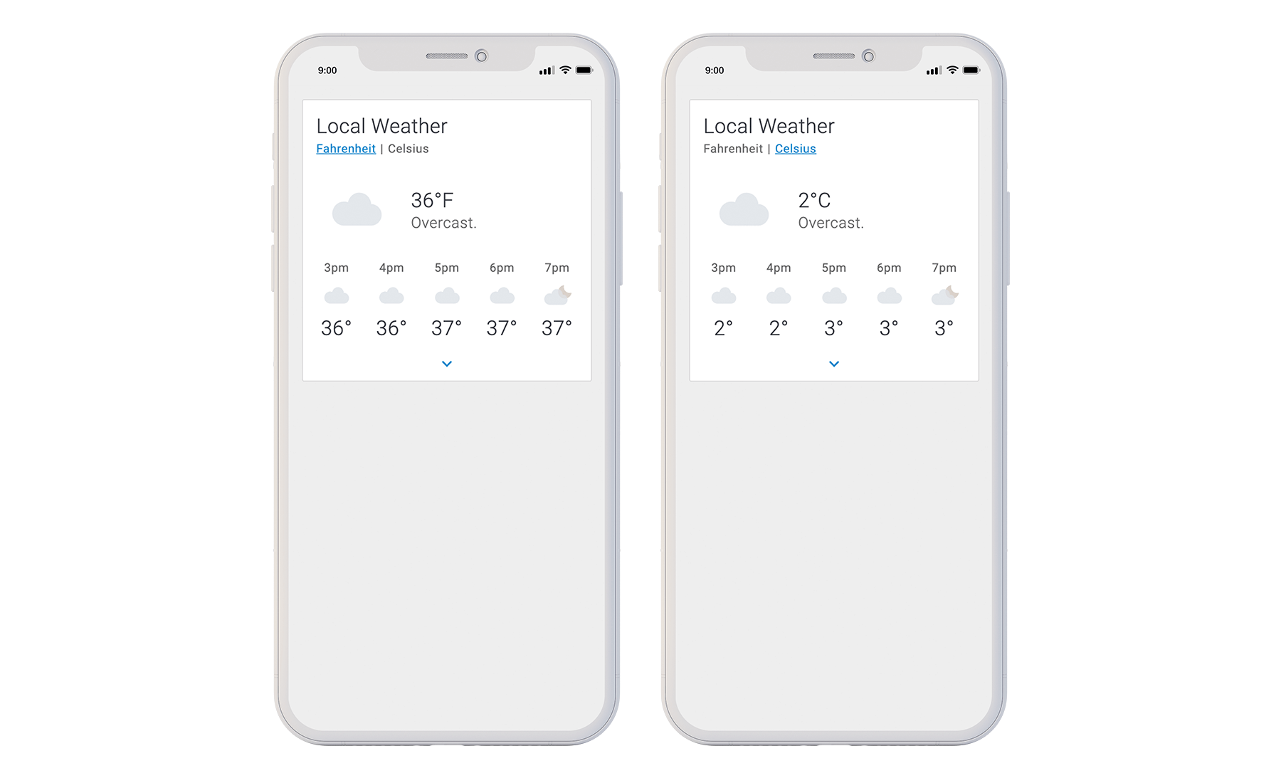
Weather
Our Weather component pulls in local weather information based on either the device's location.The default temperature scale can be set via the Component’s Options menu. Consumers can also change the temperature scale once they interact.
Studio configuration options:
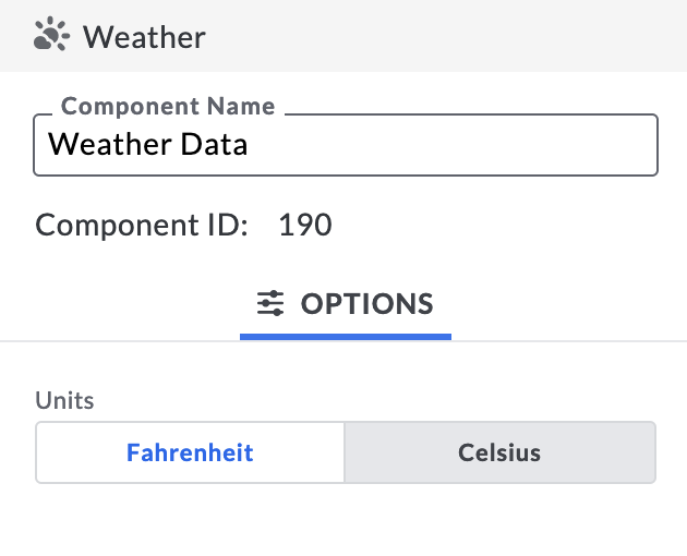
Additionally the end user can choose between Fahrenheit and Celsius.
Verified
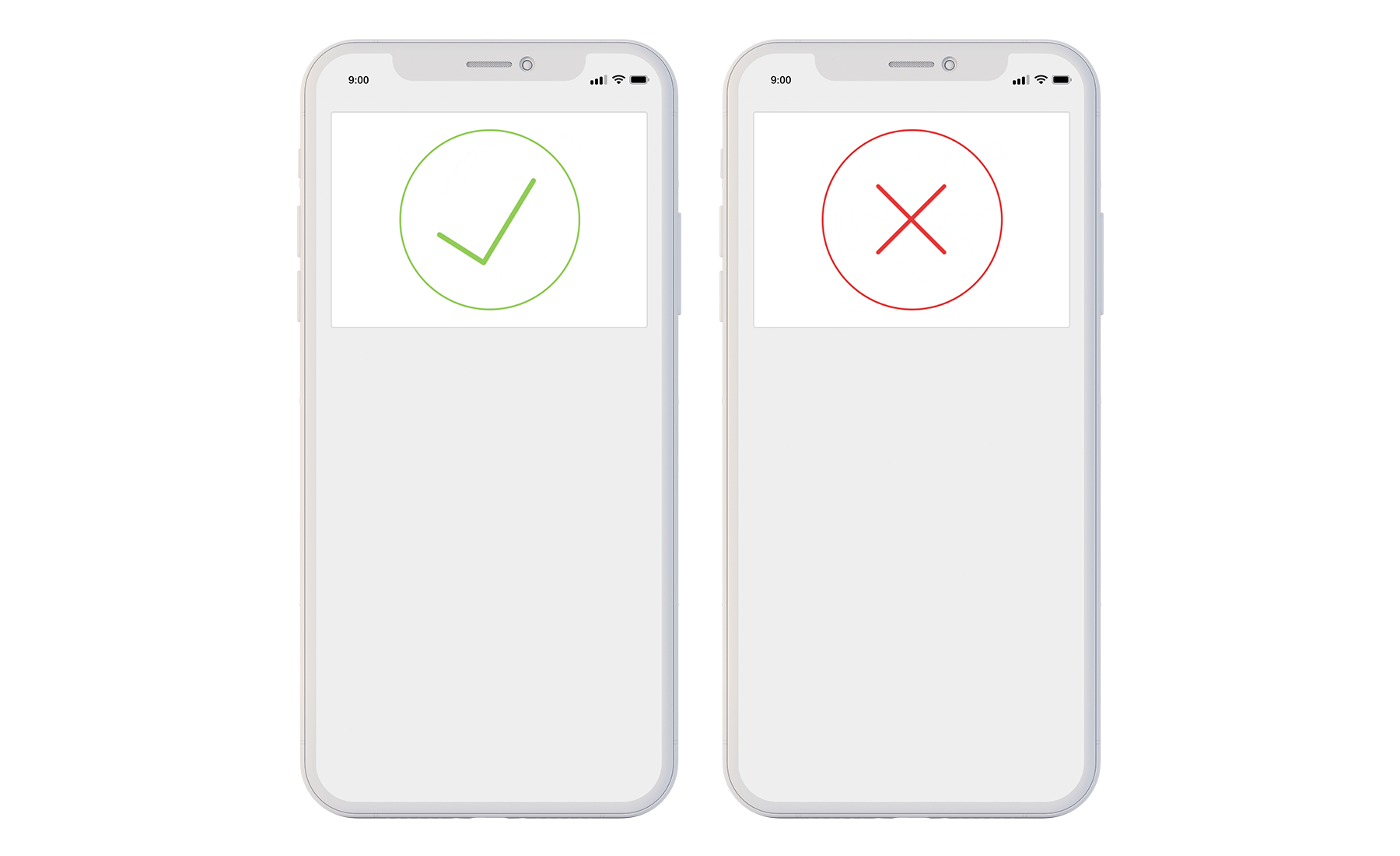
The Verified component will render either a check-mark or an x-mark depending on whether the interaction is verified or not verified, respectively. A Verified Experience can only render when a consumer taps an NFC tag with authentication enabled. If a consumer tries to share or refresh a Verified link, they will be shown an unverified Experience – this security measure is in place to prevent bad actors from mimicking verified interactions.
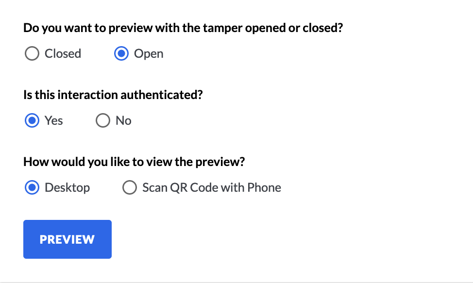
To preview verification and tamper status, use the Object Manager's preview tool.
Note: Make sure your NFC tag-type supports verification.
Cookie Banner
The cookie banner component will add a consent banner to the mobile experience. The cookie consent banner will prompt users to consent to tracking via browser based cookies and any 3rd party analytics on the page.
The consent banner reads: "This website uses cookies to provide reliable, secure, and tailored experiences. By proceeding you consent to our cookie usage. Please see our Cookie Policy for more details"
Based on the user's device settings, the consent copy will be automatically translated into one of nine different languages. These languages are: English, Spanish, Chinese - Traditional, Chinese - Simplified, Korean, Japanese, French, German, Italian.
A Cookie Policy URL must be provided to use the cookie consent banner.
Snippet
The Snippet component is primarily used for text editing and embedding custom content. It can be used as Raw HTML (most often leveraged for simple text editing and applying custom fonts) or as an iFrame to embed content from third parties like Spotify, Soundcloud, Vimeo, Google Forms and more.
Countdown
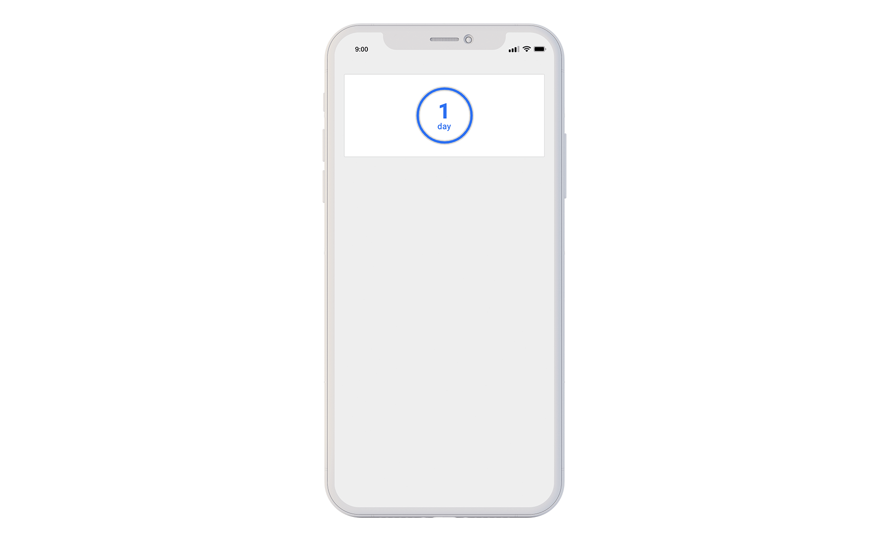
The Countdown component displays a circular countdown dial based on a predetermined Start and End date. The input for each date field is a fixed global time based off of Greenwich Mean Time (GMT), not by the device's local time. Countdowns are most often used to promote content that will be released at a future date.
Wrappers
Wrappers are containers that group components. Each wrapper has specific features that enable you to add conditional logic, special effects and styles to your Experiences. Create elements of surprise with the Delay wrapper, use the Exclusive wrapper to create distinct Verified and non-Verified Experiences, stylize components with the Section wrapper, and gather user data with Forms, among other uses. Wrappers are a great way to express creativity and customize Experiences specifically for your audience.
Section
The Section wrapper allows you to apply styling in bulk to all nested components and wrappers – you can adjust size, color, padding, and more. We recommend grouping all appropriate components and wrappers in Sections in order to create seamlessly designed Experiences.
The Section Wrapper has two display options: Block, the standard CSS display property that generates line breaks both before and after content, and the Flexible Box Module (Flexbox for short). Flexbox is the display property that allows you to customize alignment, wrapping and space distribution between content.
Tip: For a deep dive into how-to style using the Section wrapper, check out: How to Style Your Studio File Using the Section Component.
As mentioned above, the Studio uses CSS pixel guideline TRBL (Top, Right, Bottom, Left), to customize padding, margin and border width.
TRBL Design Table Example
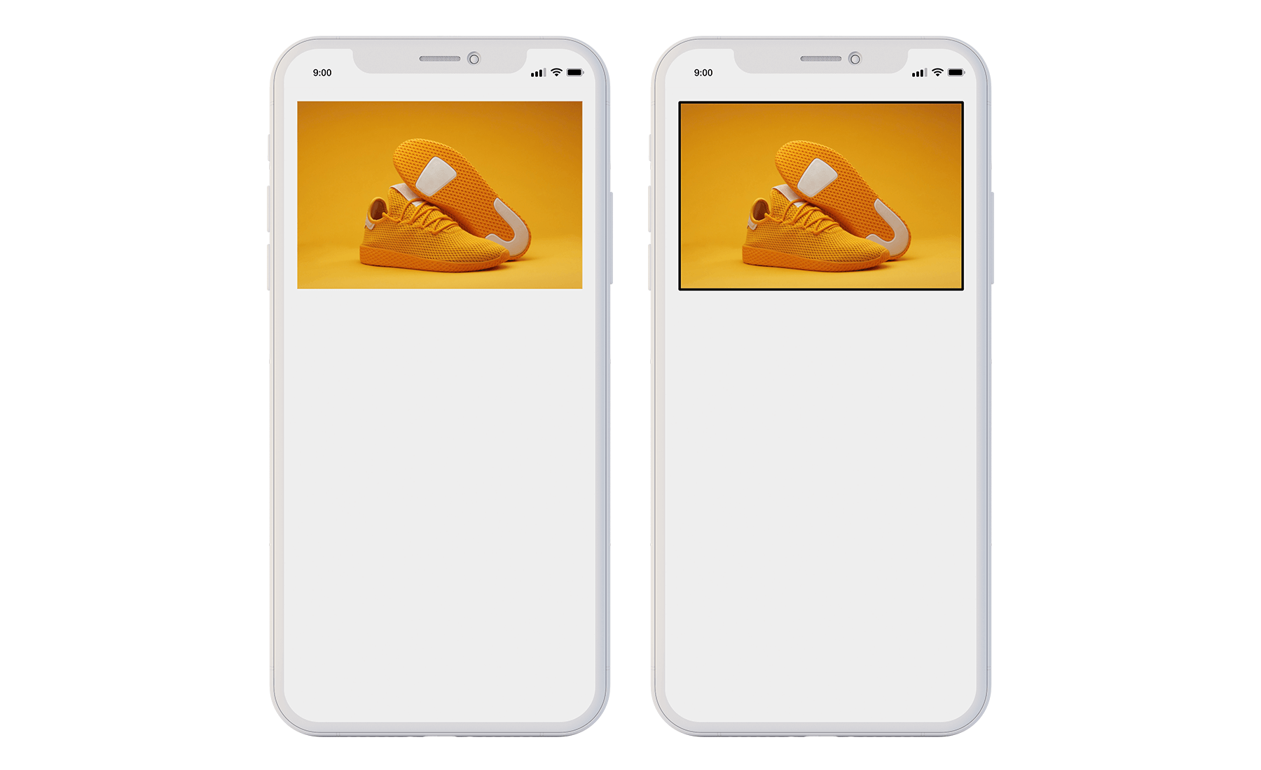
Image Component without Section Wrapper (left). Image Component Nested in Section Wrapper to Add Border (right).
Gallery
The Gallery wrapper displays images in either a grid or a swiper format. Images can then be programmed to link to URLs, Action variables, other Experiences or Form Submits.
Grid and Swiper
The Grid row size can be 1-6 images. Best practice is to have a maximum of 10 images in the swiper. The swiper is denoted by indicator “dots” underneath the images.
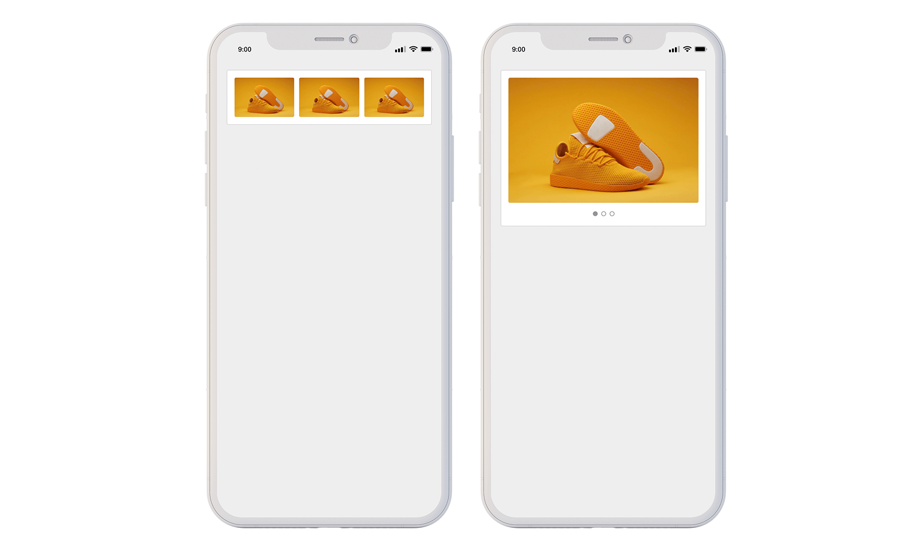
Images displayed as Grid (left). Images displayed in swiper (right).
Form
Use the Form wrapper to collect information directly from users engaging with your Experience.
Forms can be customized with text inputs, dropdowns, checkboxes and hidden fields. Once a user submits their Form, it will automatically hide.
Check out How to use the Studio's Form Component with HubSpot for a step-by-step guide on integrating HubSpot into your Studio file. Even if you’re not using Hubspot, this is a great resource to see examples of how the components below are used — particularly the more technical fields.
Note: The Form wrapper must be configured in tandem with a 3rd party CRM, such as HubSpot, to collect user responses. Blue Bite does not store this consumer data submitted via forms.
Form Wrapper Options
Component Name
The name of the component. This will only appear in the Editor – it will not appear on the rendered experience.
Title
The name of the Form. This will be shown to the user in the Experience.
Type
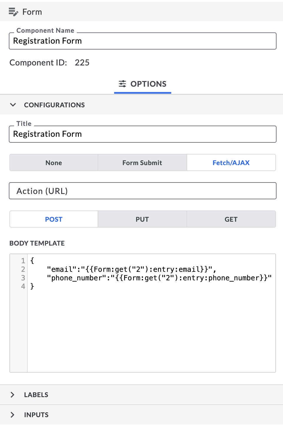
Form Submit: Sends data to a CRM. Blue Bite does not store consumer data. The form submission sends data using standard HTML protocol. Submissions are synchronous and reload the page. As such, Form Submit is fine to use for QR or NFC tags that do not support verification.
Fetch / AJAX: Like Form Submit, this type also sends data to your CRM form handler (Blue Bite does not store consumer data). However, the Fetch / AJAX submission is asynchronous. After the user submits their data, that data will be sent to your configured CRM form handler without redirecting or refreshing the page. Since the page does not reload, this method is preferred when using verified NFC tags.
See How to use the Studio's Form Component with HubSpot for a step-by-step guide to creating a Fetch / AJAX form in the Studio which captures user data and sends it to a Hubspot CRM account.
None: User data will not be sent to a CRM form handler, nor will it be stored by Blue Bite. This type is best used to set an alternate Action after form submission, such as hiding or showing content (e.g. a passcode), or updating an object or local variable.
Action (URL)
The API endpoint that the Studio will send form data to.
For example, this is HubSpot’s API endpoint:
https://api.hsforms.com/submissions/v3/integration/submit/:portalId/:formGuid
Method
Method describes the type of request to make when submitting the form. Your CRM will specify how form data should be sent, either via GET, PUT, or POST methods. Make sure to align with your CRM's documentation.
Form Component ID
Each component is assigned an ID when it is created. These IDs were previously hidden in the Blue Bite Studio, but they now appear in the Form component to help with programming your studio file. For example, when using a Form Macro like {{ Form:get("<ID>"):status }} you need to program the macro with the correct ID for the macro to work.
Form Inputs

Checkbox
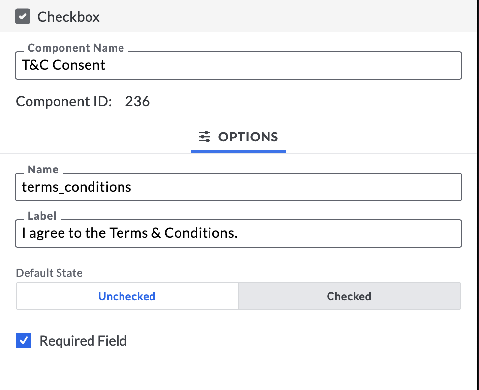
Use the Checkbox component to collect a TRUE or FALSE field for the form.
Name: The internal key a given CRM form handler is expecting. This field name must match the field specified in your CRM.
Label: The name of the Input which will appear on the Form. This is visible to the consumer.
Default Checked: If true, the Checkbox will be checked when the form loads. If false, the Checkbox will not be checked when the form loads.
Required: If this is true, consumers must check this Input in order to successfully submit the form.
Hidden Input
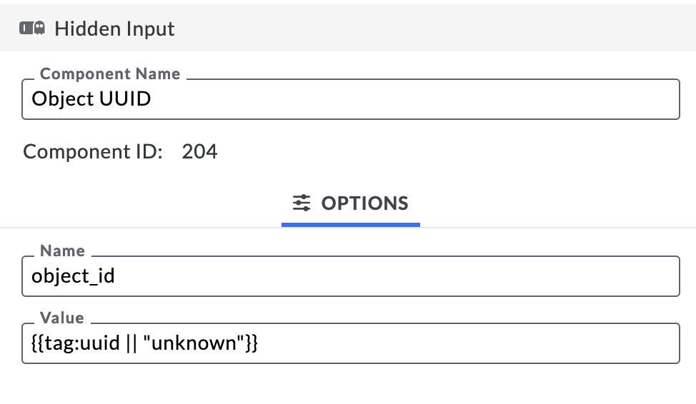
The Hidden Input field is not visible to the end consumers, but instead passes information from forms to your linked CRM. Utilize this input to identify the data's source or use macros to passback additional Object data. For example, the value, {{ tag:uuid|| "unknown" }} to link the UUID of your object to the form submission.
Name: The internal key a given CRM handler is expecting. This field name must match the field in the CRM.
Value: Enter the information you want to pass to the CRM, or use Macros in order to submit Object information to the CRM.
Input
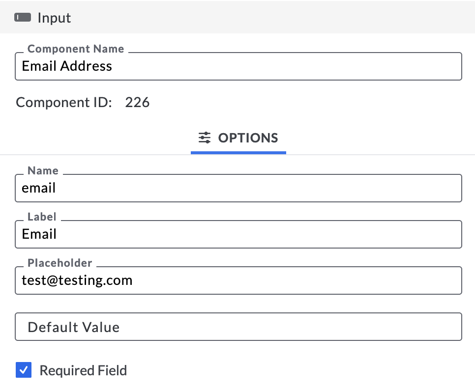
Use the Input component to create a text field for forms.
Name: The internal key a given CRM form handler is expecting. This field name must match the field specified in your CRM.
Label: The field name that will appear on the Form. This is visible to the user.
Placeholder: Text to show users an example of what should be entered in the field.
Default Value: The default input if a user does not specify one.
Required: Check this box if users must fill out this Input in order to submit their form.
Note: If you make an Input required, we recommend including an asterisk in the field name to indicate to the consumer they must include this information in order to submit the form.
Select
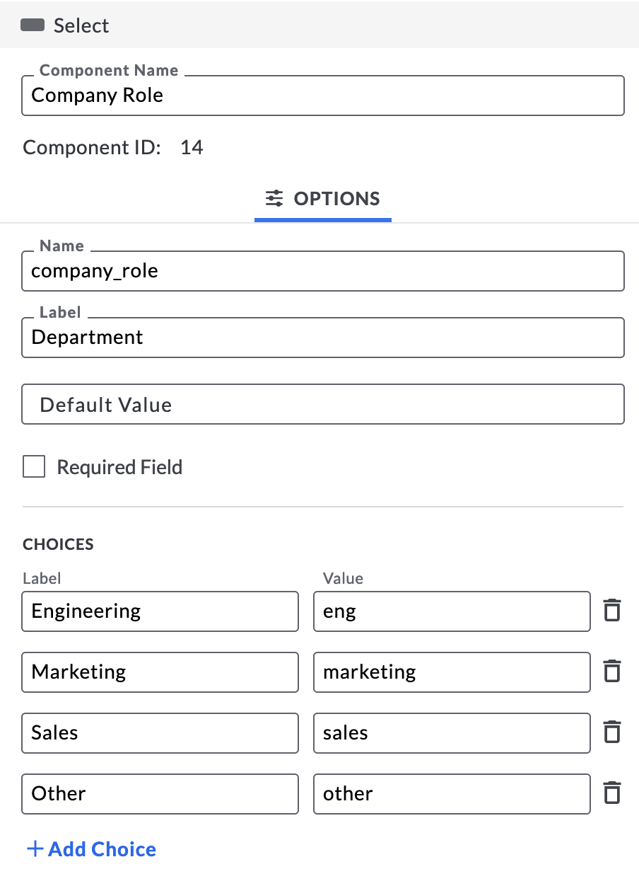
The Select component creates a dropdown list for your form.
Name: The internal key a given CRM form handler is expecting. This field name must match the field specified in your CRM.
Label: The name of the Input that will appear on the Form. This is visible to the consumer.
Default Value: The default input if a user does not select an option from the list (this is optional).
Option Labels: The values a user can choose from the list. Add your values, separate them with commas (ex. USA, Mexico, Canada, Brazil), and they will show in the order you enter them, from top to bottom.
Option Values: The name of the value, from the Options Labels, that will be sent back to the designated CRM. These values must correspond to the order of their respective labels.
Example:
Label: Color
Option Labels: Red, Green, Blue
Option Values: r, g, b
Required: Check this box if users must fill out this Input in order to submit their form.
Exclusive
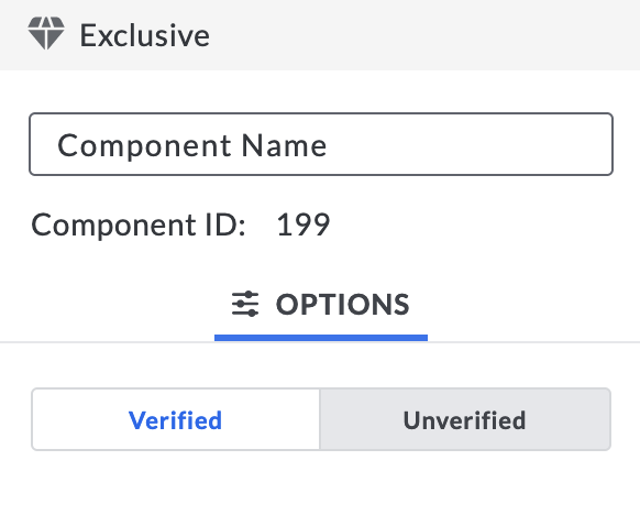
The Exclusive wrapper is used for authentication purposes. It has two configurations, Verified = true and Verified = false, and will show or hide its nested components based on the result of the NFC interaction matches If objects do not support verification, the default state of any Interaction is Verified = false.
Schedule
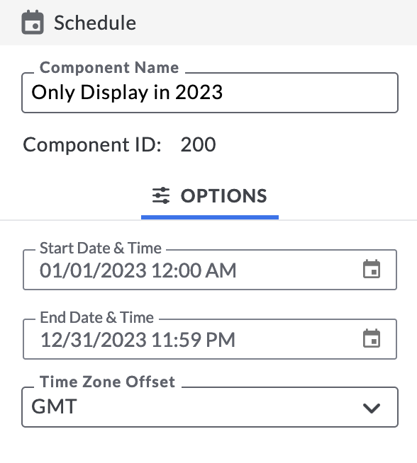
Components nested in the Schedule wrapper will only appear during a predetermined period of time. Start and End dates are configured as a fixed global time and are formatted in Greenwich Mean Time (GMT). The nested components will be shown only between the start date and end dates and will be hidden before and after.
Delay
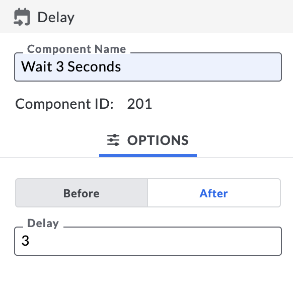
The Delay wrapper will initiate Actions or reveal nested components after a predetermined number of seconds. The default is 3 seconds, and you may adjust to the desired number of seconds.
Tip: Use the Delay wrapper set to Before to show an interstitial, a short GIF or brand image. After the programmed number of seconds, the image will disappear. If you set the rest of the experience in a Delay wrapper set to after equal to the same amount of seconds, the rest of the experience will appear after your interstitial.
Event
Event wrappers reveal components once a set criteria has been met or an action has occurred. Utilize the Event wrapper to show a confirmation message on form submit, display content based on device location, or reveal an image.
Event Types

Form Submit:
Show components or wrappers a consumer will see before and/or after their Form has been successfully submitted.
Before: The wrapper contents will only show before the Form has been submitted.
After: The wrapper contents will only show once the Form has been submitted.
Note: If a Form is wrapped in an Event wrapper and is set to Form Submit → Before, once a user has submitted the Form, the Form will hide and can only be reshown if a user clears their cache history.
Form Error:
Show components or wrappers if a Form has been submitted unsuccessfully.
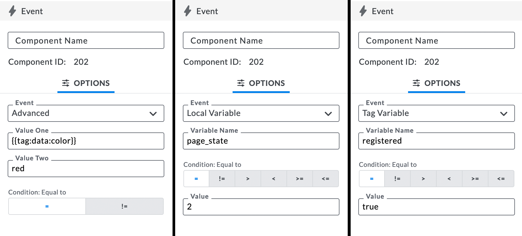
Local Variable:
This associates an Event with an Action component. It will fire components and/or wrappers that are nested within it once a set condition has been met.
Tag Variable:
This associates an Event with Object Data. It will show components and/or wrappers if the Object Data meets the specified conditions.
Advanced:
This allows you to create your own event type that compare two values
Location-based conditionals are one common implementation of Advanced Events.
Example: This event will only show the components nested if the user's current location is less than 100 meters away from Berlin.
Event Type: Advanced
Value One: {{ Location:distance( Location:watch( "geo_fast",1, {} ) || "",Location:new( 52.520007, 13.404954, {} ) || "" ) || "" < 100 }}
Value Two: True
Condition: = See “Macros” for more information on how to utilize macros in the Studio.
Variable Name
If you want to use local variables to define event logic, they will need to be declared before they can be leveraged in an event wrapper.
Condition
The logical action component which determines whether or not the set criteria has been met to satisfy the variable condition.
Note: Only Available for Variable Event Types.
Value
The value required to satisfy the variable condition in order for the outcome to occur (True, False, 1, 2, 3, etc.).
